A UX process starts with a need. It starts with finding a user hurt point that is to be solved.
ClassMe - an app for childrens' parents and for class-guides, which sync the necessity for them both
of managing, updating and feedbacking the matters of process, comments and payments.
The project was made as final project on 'Netcarft Academy - User Experience class' and includes the parents end only.


Research is a fondemental stage on a UX process. It helps to understand the user, the audience and the need. Besides an extensive benchmark, which may help finding trends and usability solutions (made on other websites/apps). Learning and knowing the clients is a major step for making the right choices and delivering the right solutions.
One of the research methods is to create a survey, a little questionnaire. Asking the right questions may lead your project to better position without just the assumptions, but with rational and informed conclusions.
The ClassMe research started with conducting more then 20 questions that were answered by 50 parents to children who are going to one or more sport classes. Another 20 questions were conducted for class guides. Some hurting points were found and some were gone, while the users (allegedly future users) revealed what has more value and importance than was thought before.


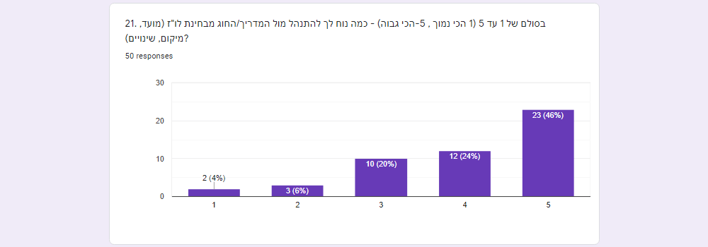
After the research some personas are being revealed and the need becomes more individual and clear. Each persona has its own lifestyle, habbits and methods of using apps. Every one of the personas earns User Story, to show a use case for using the application. We can learn and find from the story - when, where and why the app is being used.
As understanding the Personas and the Users Stories, a user flow is being made - the User Scenario and User Journey.
It is the basis for the app usabilty process and app screens, showing us where the user starts his path, where he should finish it,
and what are the stages and actions that the user do in order to reach his goal.
If you have the opportunity, a warm brainstorming may be helpful with interesting and different points of view.
The ClassMe User Scenarios includes 3 usability options and goals:
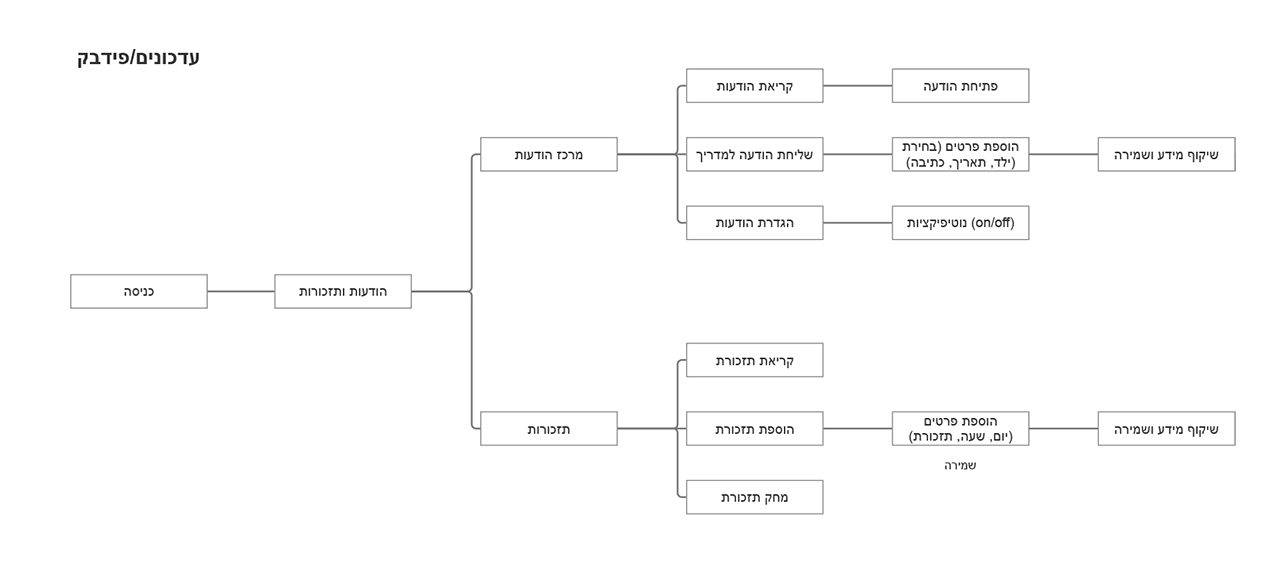
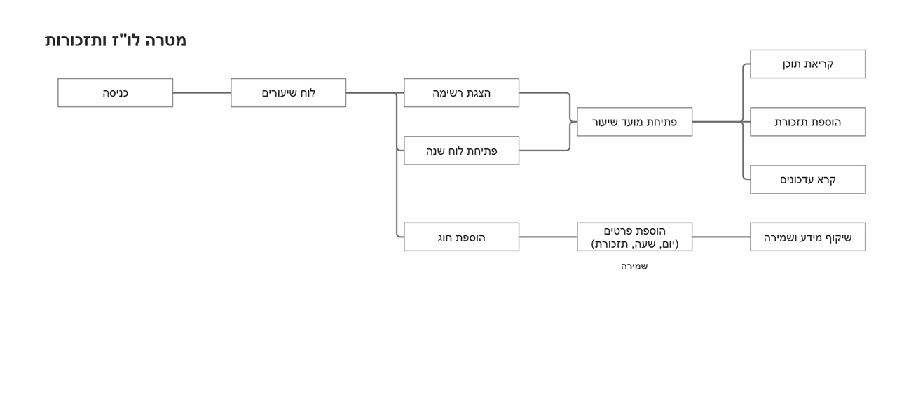
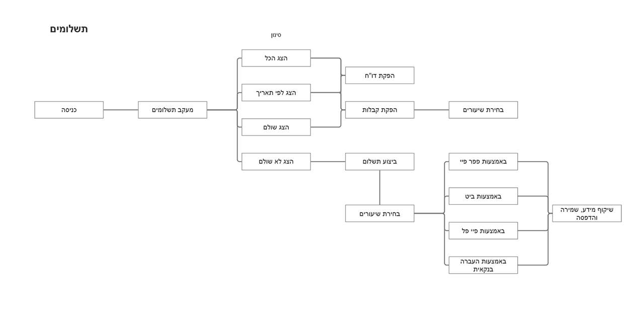
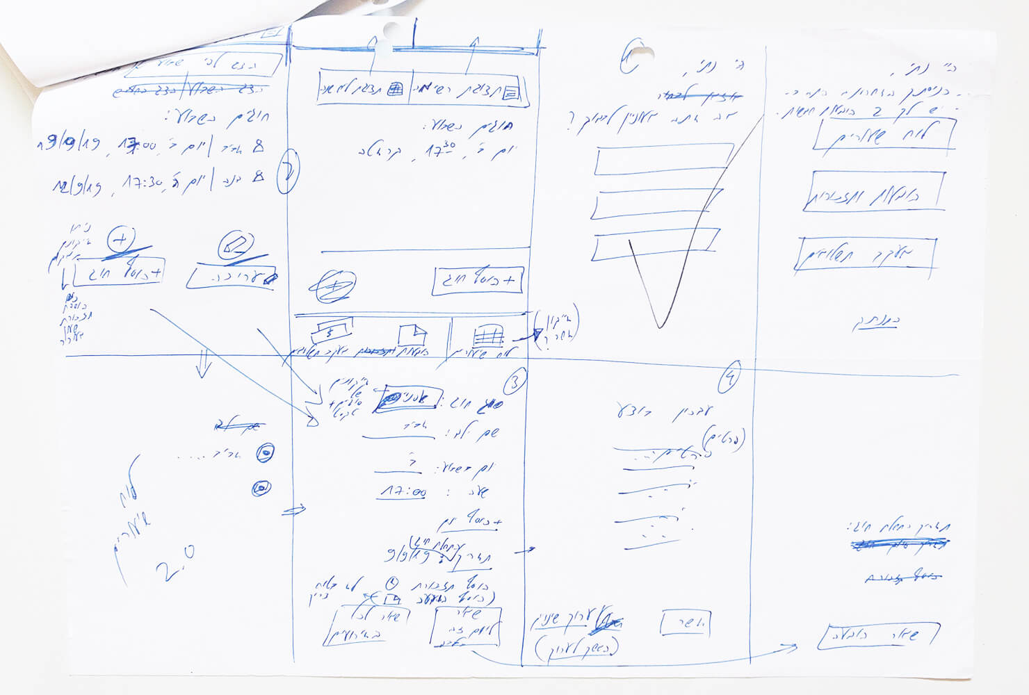
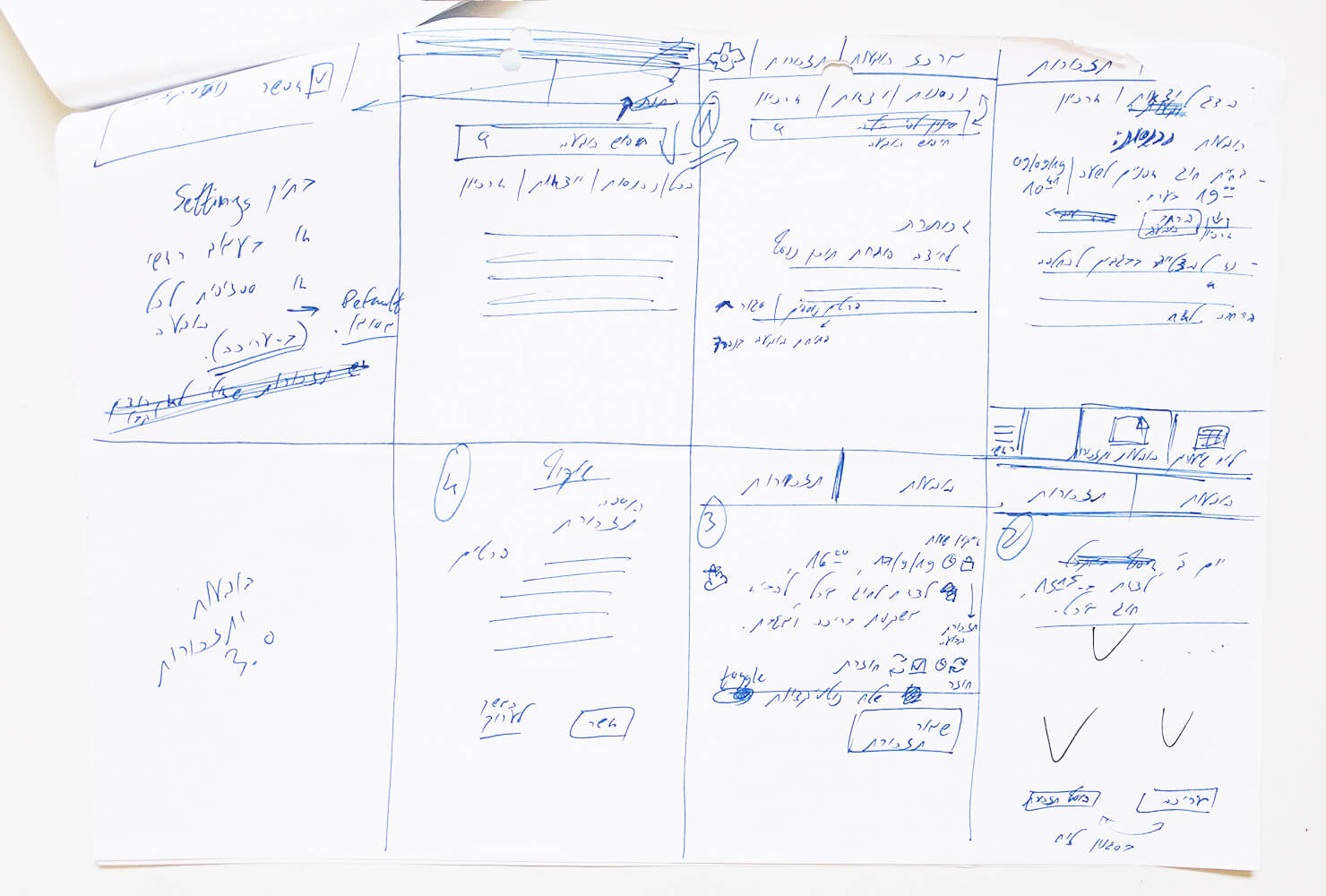
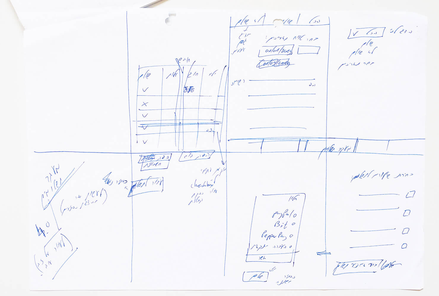
Having the user flow as titled-app-stages can now become to a sketch of screens.
Each step on the user jurney earns a screen, and each screen earns its parts, elements, widgets and moduls that are to be placed and later designed.
Placing the required element in the optimized position for the user to reach his goal - is what the UX is all about -
and it starts with a free, light, first draft sketch.
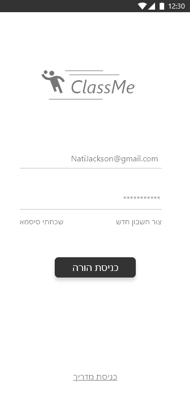
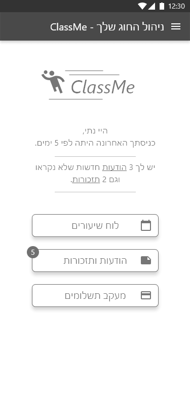
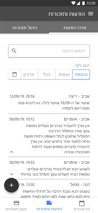
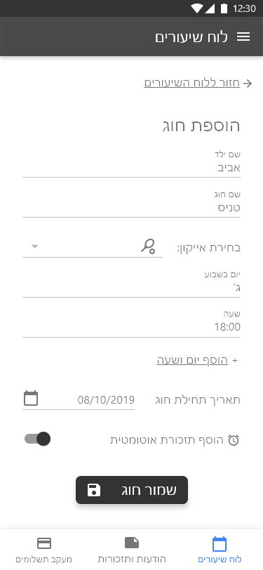
The sketches on ClassMe project shows first draft of the login-onboarding stage and the managing boards (and screens) of classes monitoring, messages center and payment tracking center.

Putting the elements to the place on Mockup-Prototype-UX software is the next step.
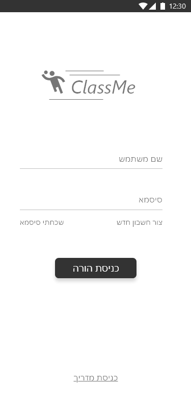
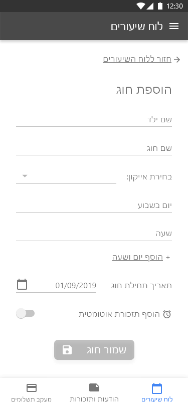
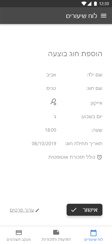
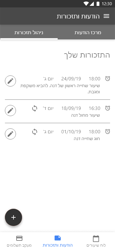
A more organized screen is being made with more fine tunning of positioning,
design and media usability settings (e.g. sizes of clickable areas, OS icons) and suggestions (e.g. sizes of fonts).
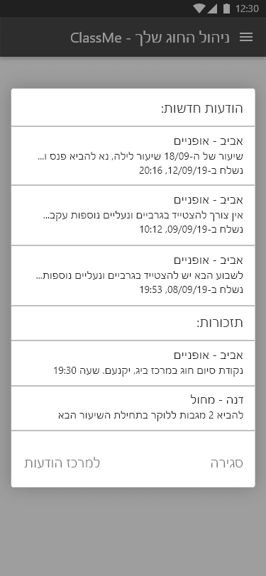
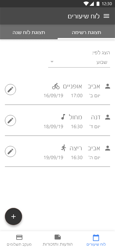
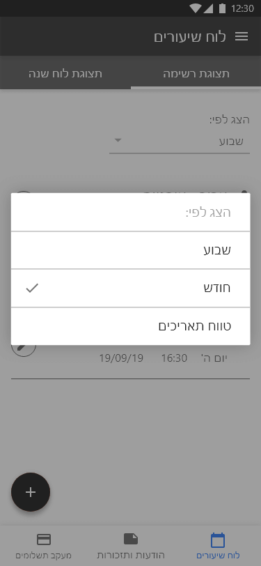
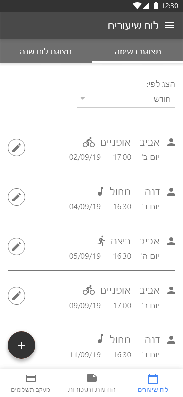
The presented ClassMe UX Screens includes 3 usability processes:





Now it's the time, when all the conclutions, definitions and guidelines are combined for a UI jurney.
Collecting the brand guidelines, colors, fonts or even spaces atributes are a phase in the important design process.
Based on the previous stages, the UI Designer earns the opportunity for thinking, finding design solutions and being creative.
The presented ClassMe project does not contain designed screens yet. You may view other app designs on UX/UI - Sport-Quest or on UX/UI at Plus500.