
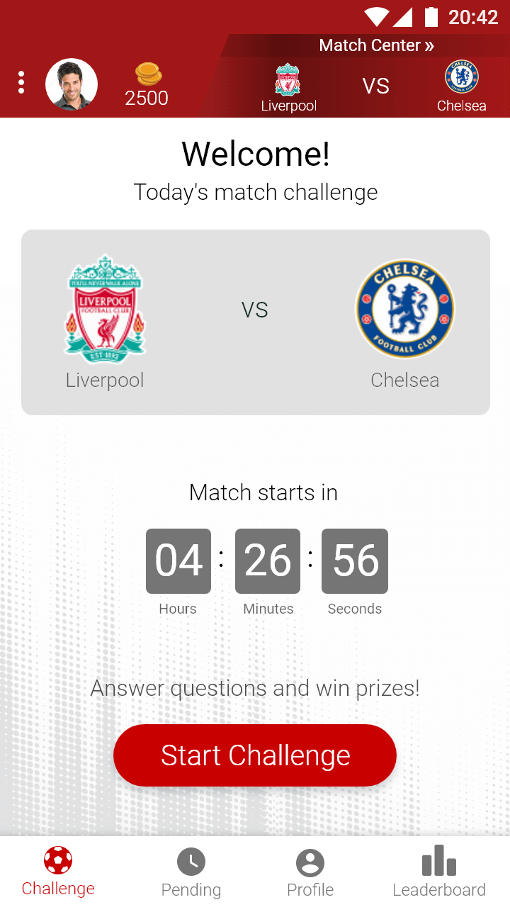
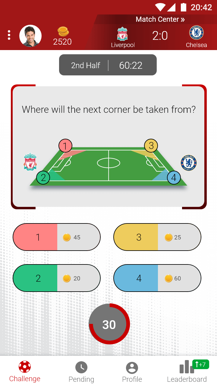
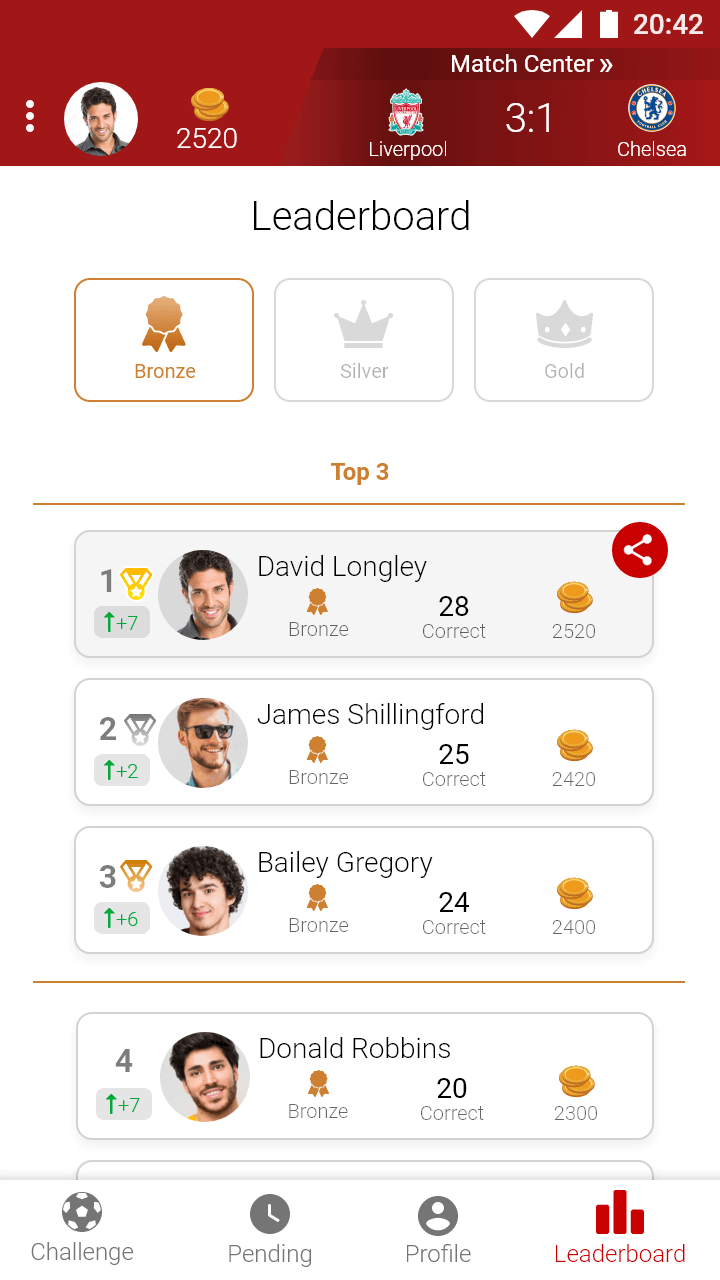
Sport-Quest - an app for sport matches viewers.
The app gives the users the opportunity to earn some prizes by answering questions while watching a sport match.
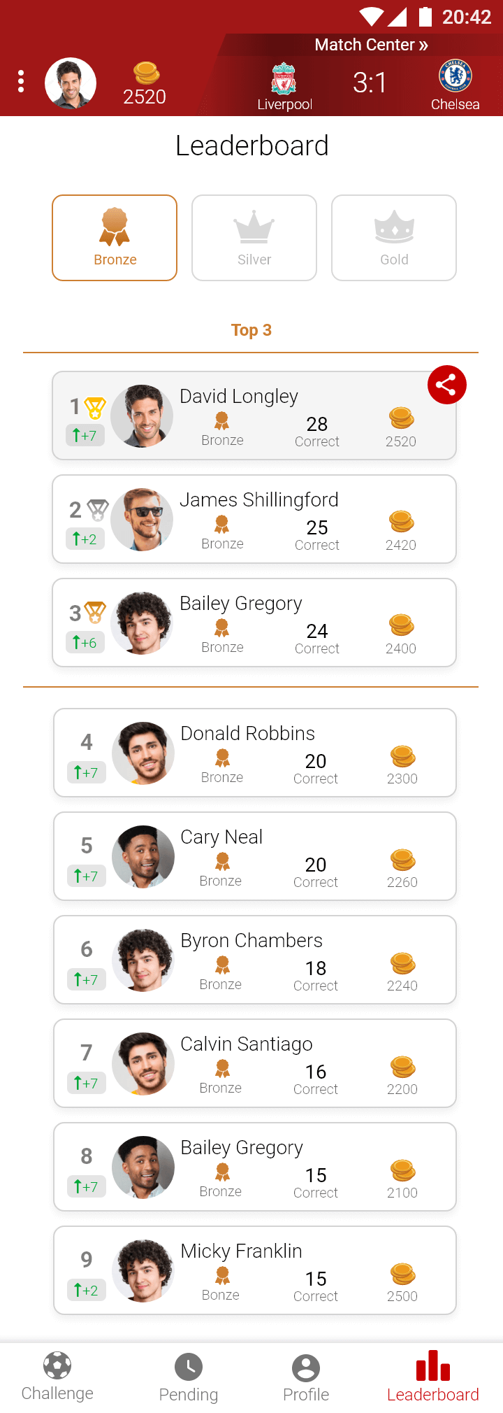
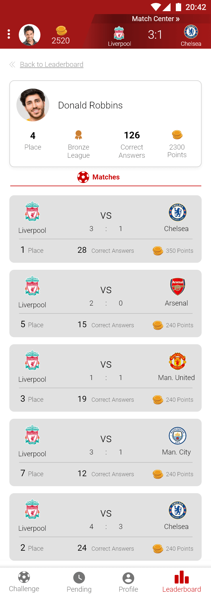
Beside knowledge and gut feeling, each user may follow data and statistics that are shown in the app.
Whether it's the ammount of times a soccer player kicked the ball (on soccer quest e.g),
or the ammount of competing users that answered the right answer or the wrong one,
the data gives the user the ability to compete and enjoy with another layer of a sport match.
* The project was made in collaboration with the designer Tali Halevy.


Research is a fondemental stage on a UX process. It helps to understand the user, the audience and the need. One of the research methods is benchmark, which may help finding trends and usability solutions (made on other websites/apps). The benchmark teaches what has been done so far, as an inspiration or as a fault. Learning and knowing the market is an important phase in making the right choices and delivering the right solutions.
On the Sport-Quest benchmark - viewing and analyzing dozens of designs and UI solutions of gaming, quizes and sports applications. At that point some innovative ideas were inspiring, while obsolete ones received the label of 'avoid from'.
On the Sport-Quest Project, since already having a website of data product, the client came with insights about his potential user. The idea of the client was to provide a quest app for end users, while it's integrated in a major company website or app (sport team or TV sport channel e.g.).
After receiving insights, more of the end user position and need were clearer.
The user, as a sport match spectator which follows the app while watching a sport match,
had to recieve solutions for the current situation.
Therefore: How clear should the app be? How many details should each screen have? How big should the items be?
The Sport-Quest end user:
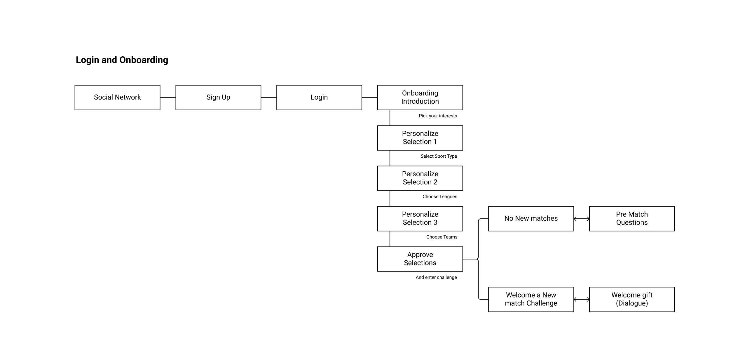
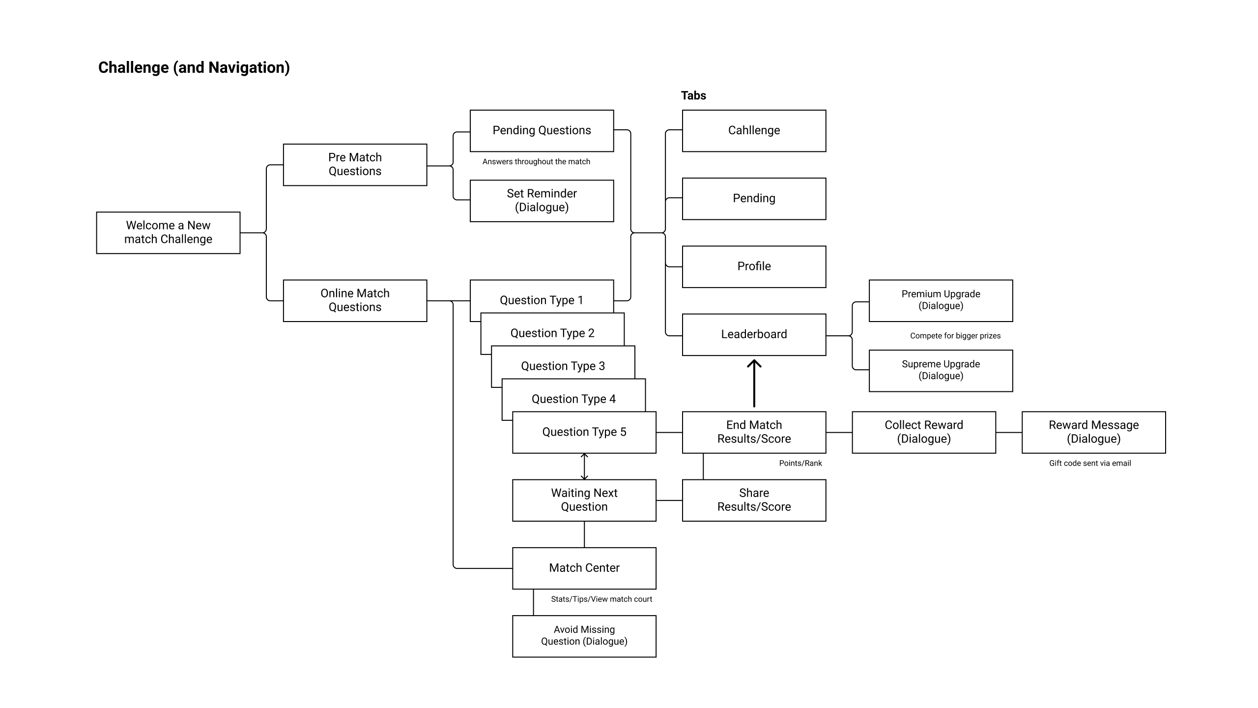
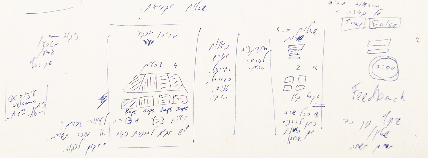
Throughout and after the research and the user flow definigs, ideas met pen and paper for first draft sketches of screens. Each user jurney step earns a screen, with elements, widgets and moduls that are to be placed and designed. Placing the required element in the optimized position for the user to reach his goal - is what the UX is all about - and it starts with a first draft sketch.
The Sport-Quest sketches shows first draft of the onboarding, introduction and questions screens that are the core of the app usability.


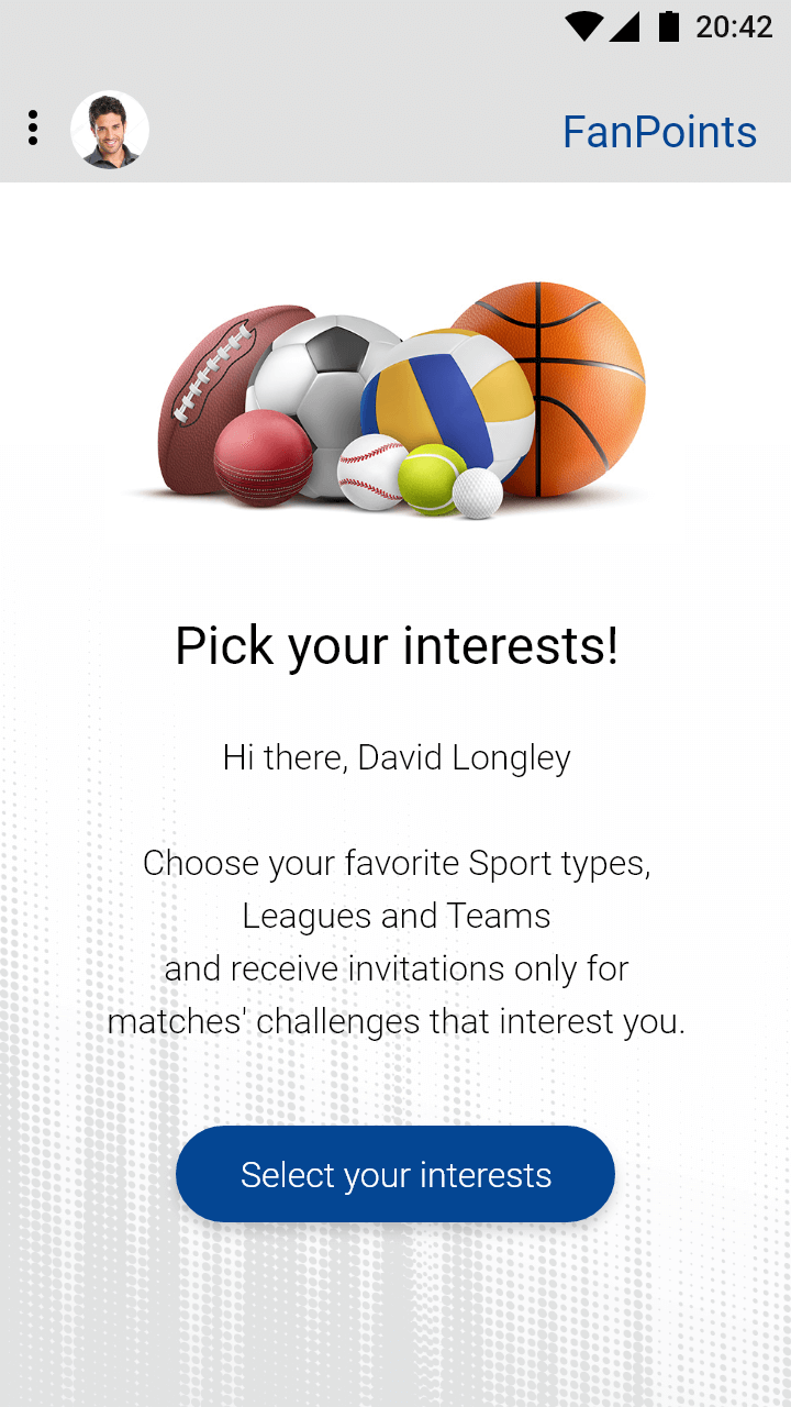
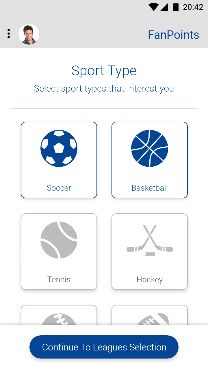
Based on the previous stages, the conclusions, definitions and guidelines are combined for a UX solutions side by side with UI journey of thinking and creativity.
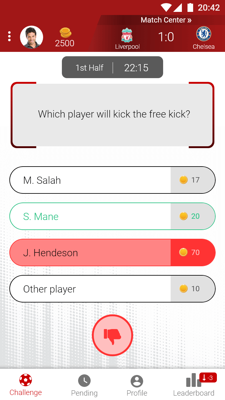
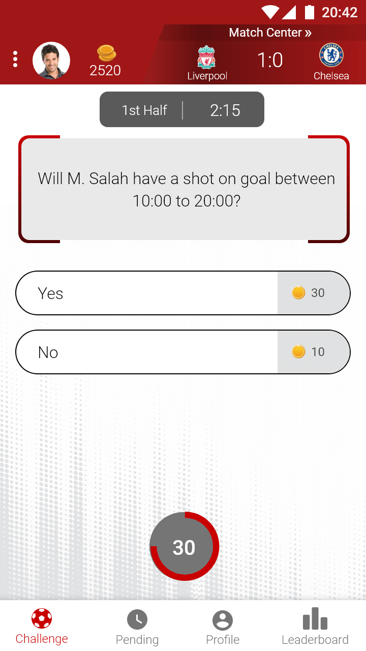
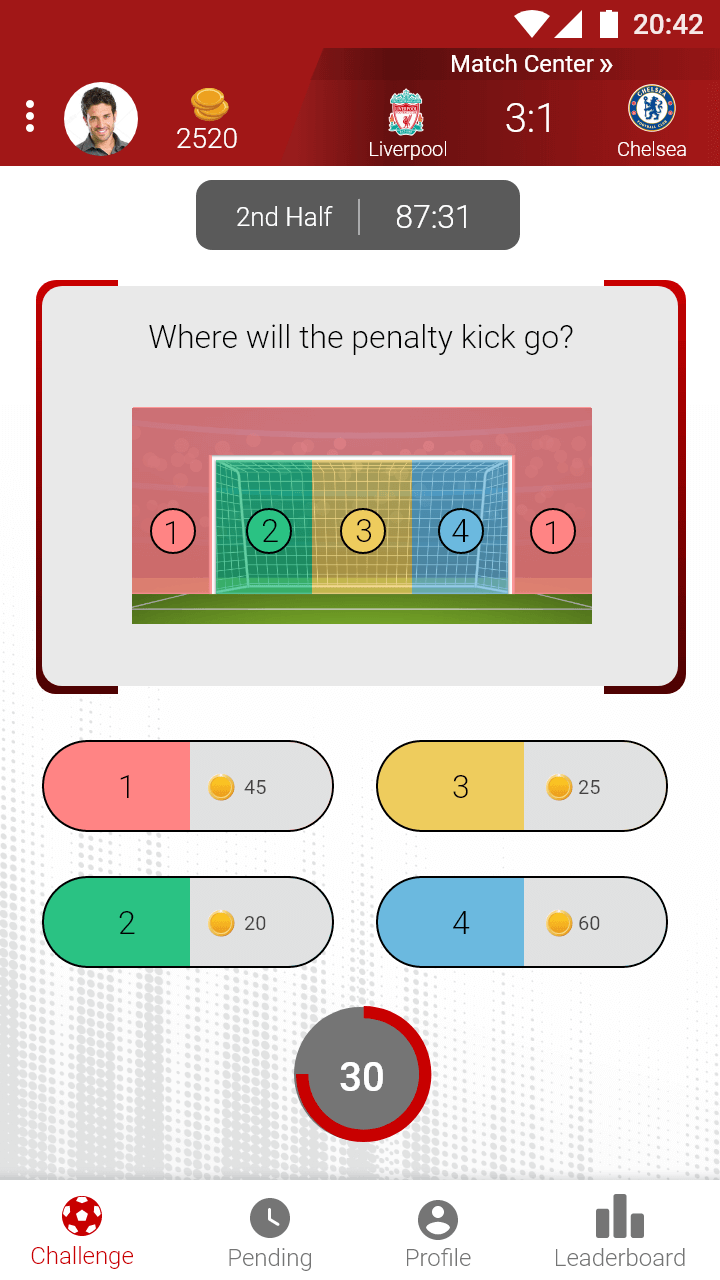
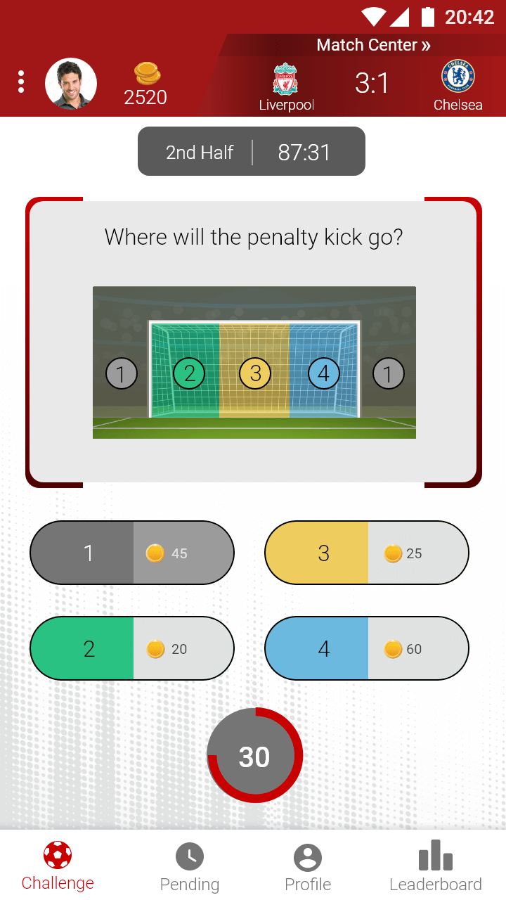
Putting the elements to the place and adding colors, elements sizes, fonts sizes and icons gives character and uniqueness to a pale Wireframe.
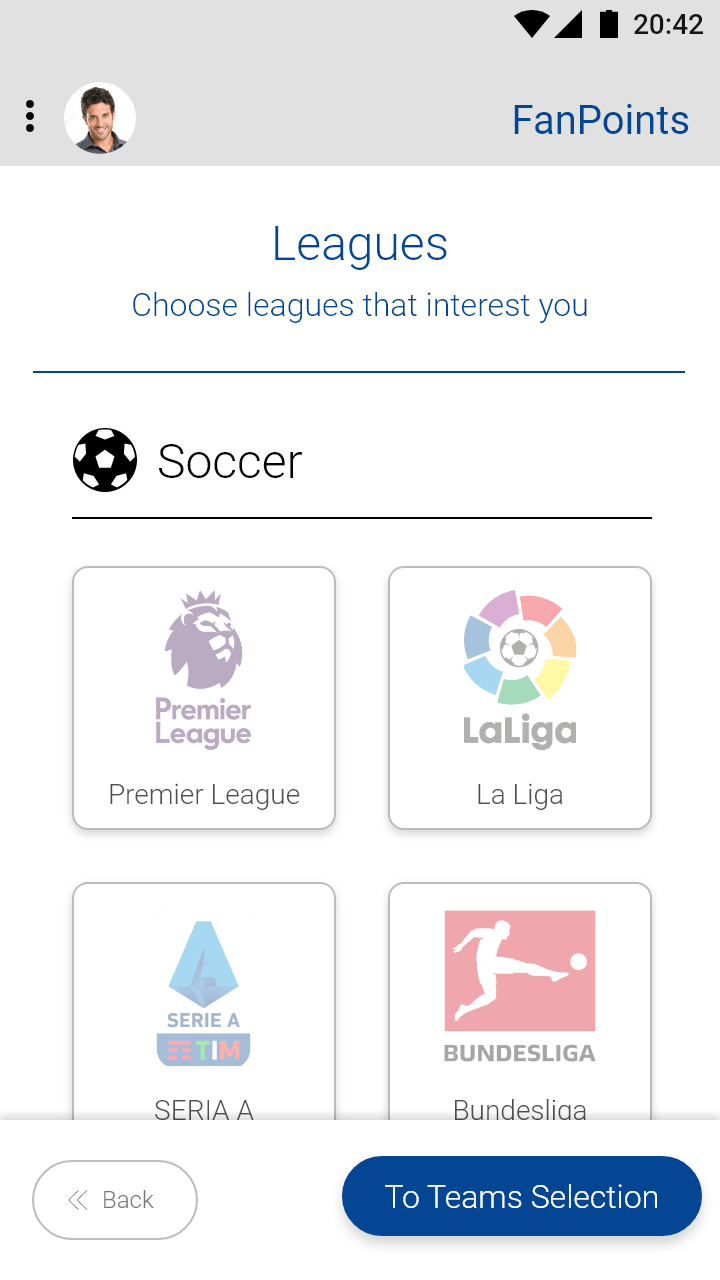
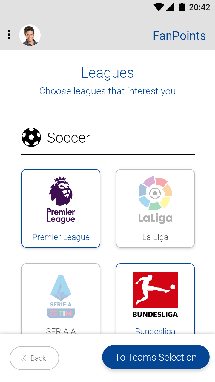
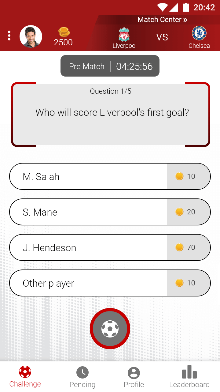
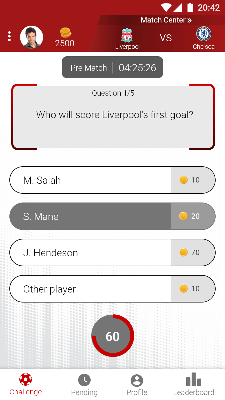
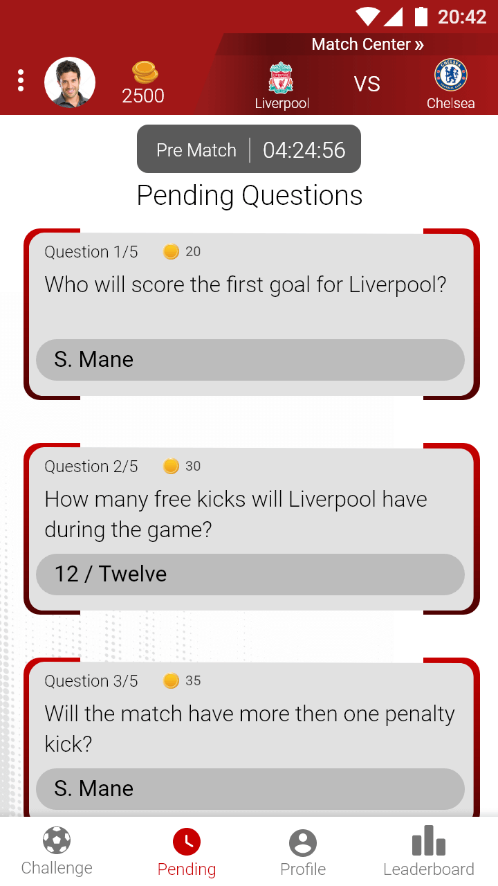
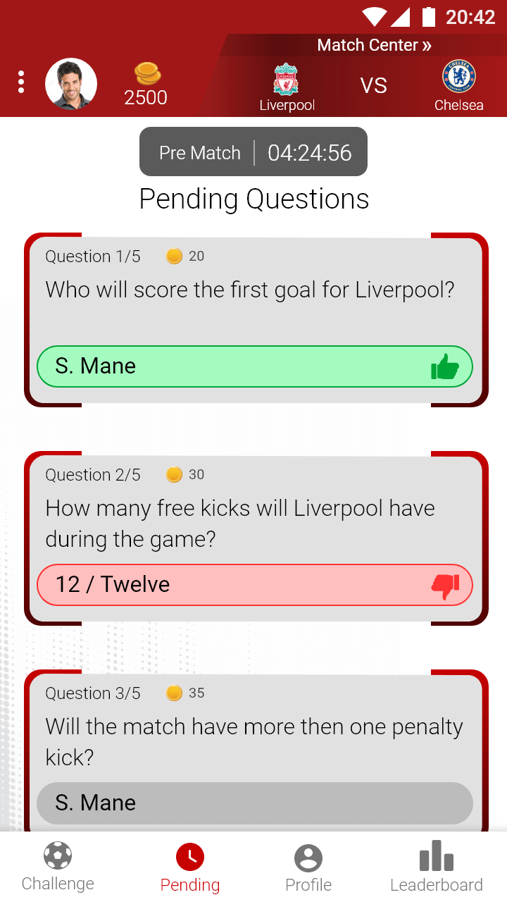
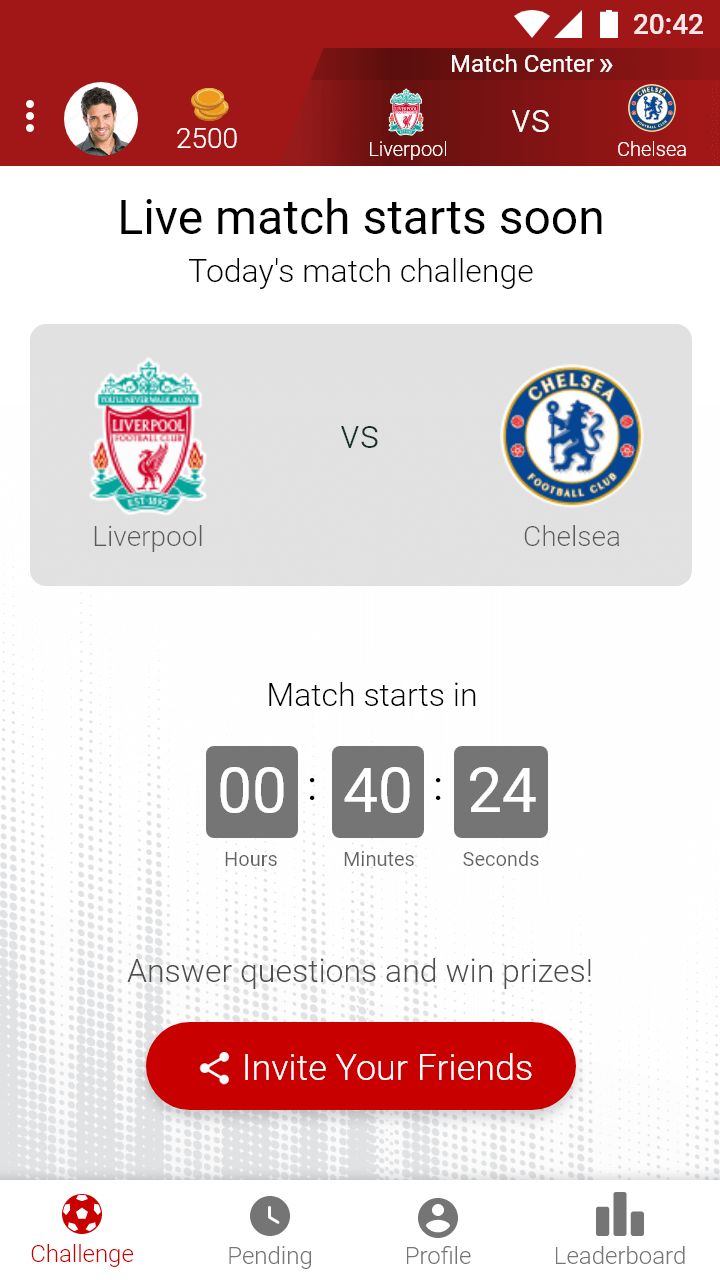
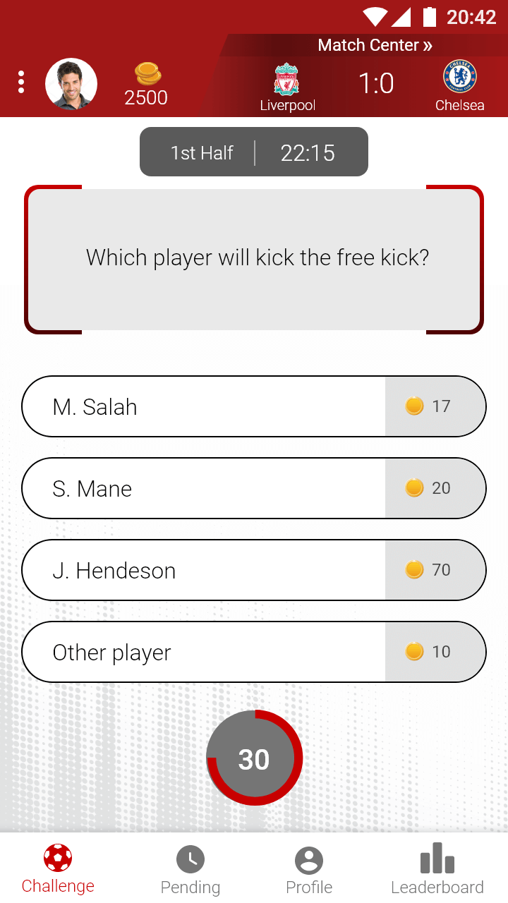
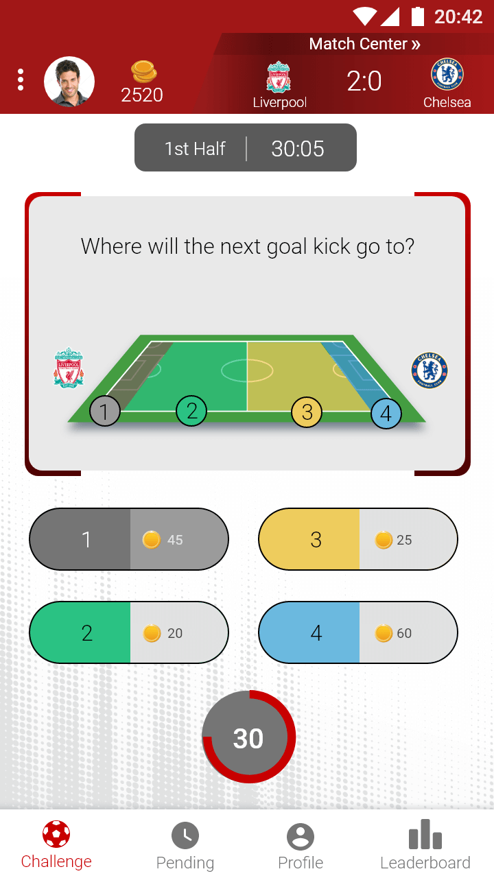
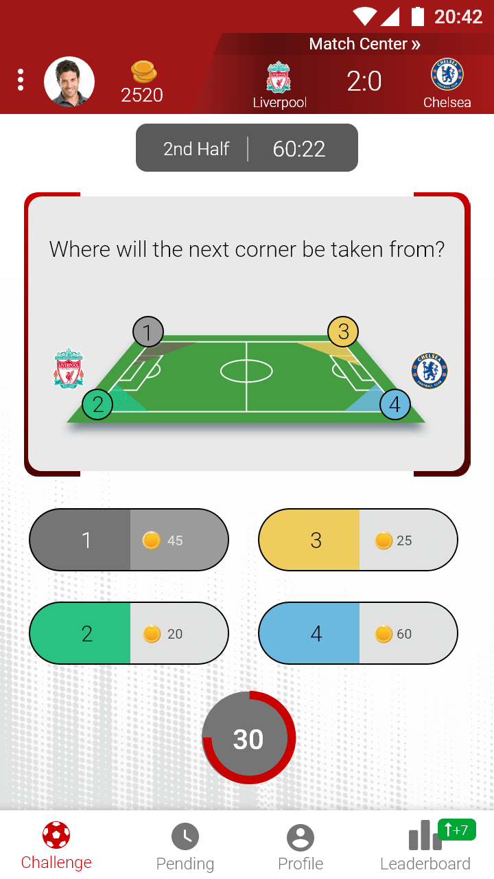
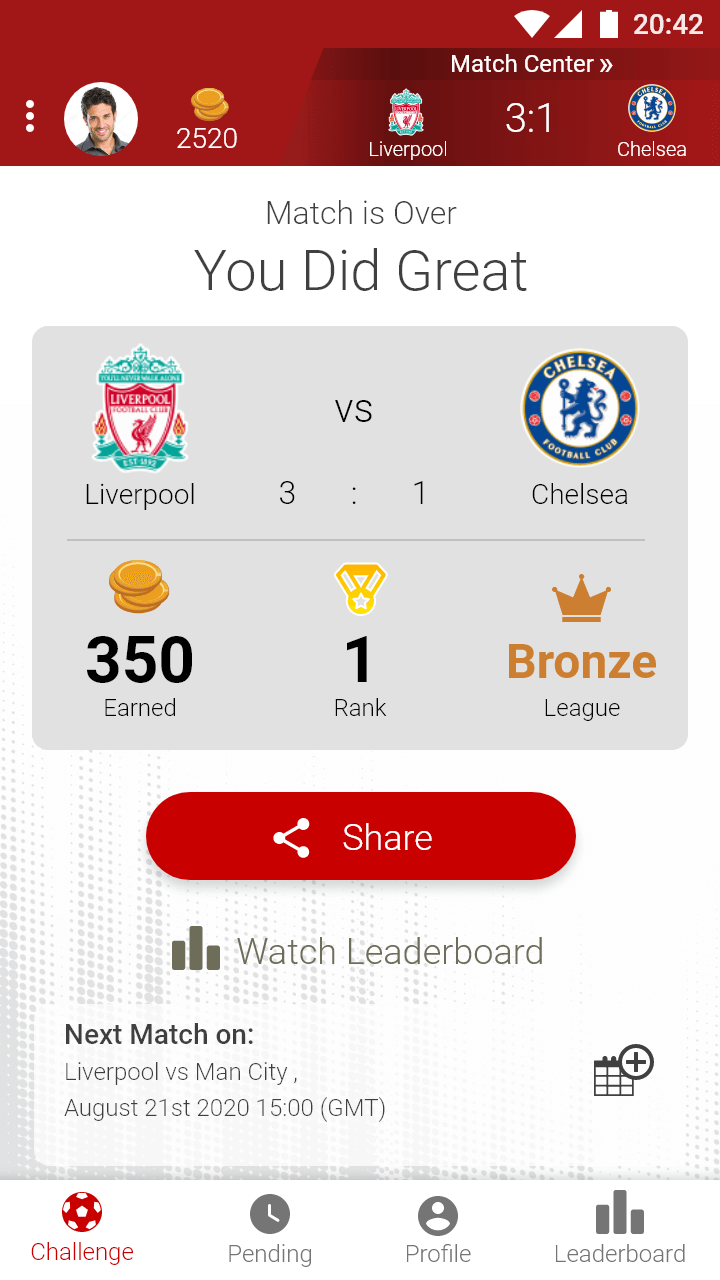
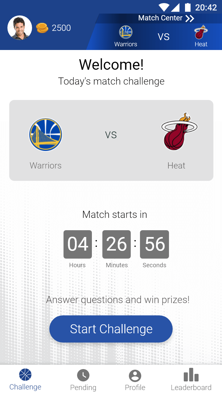
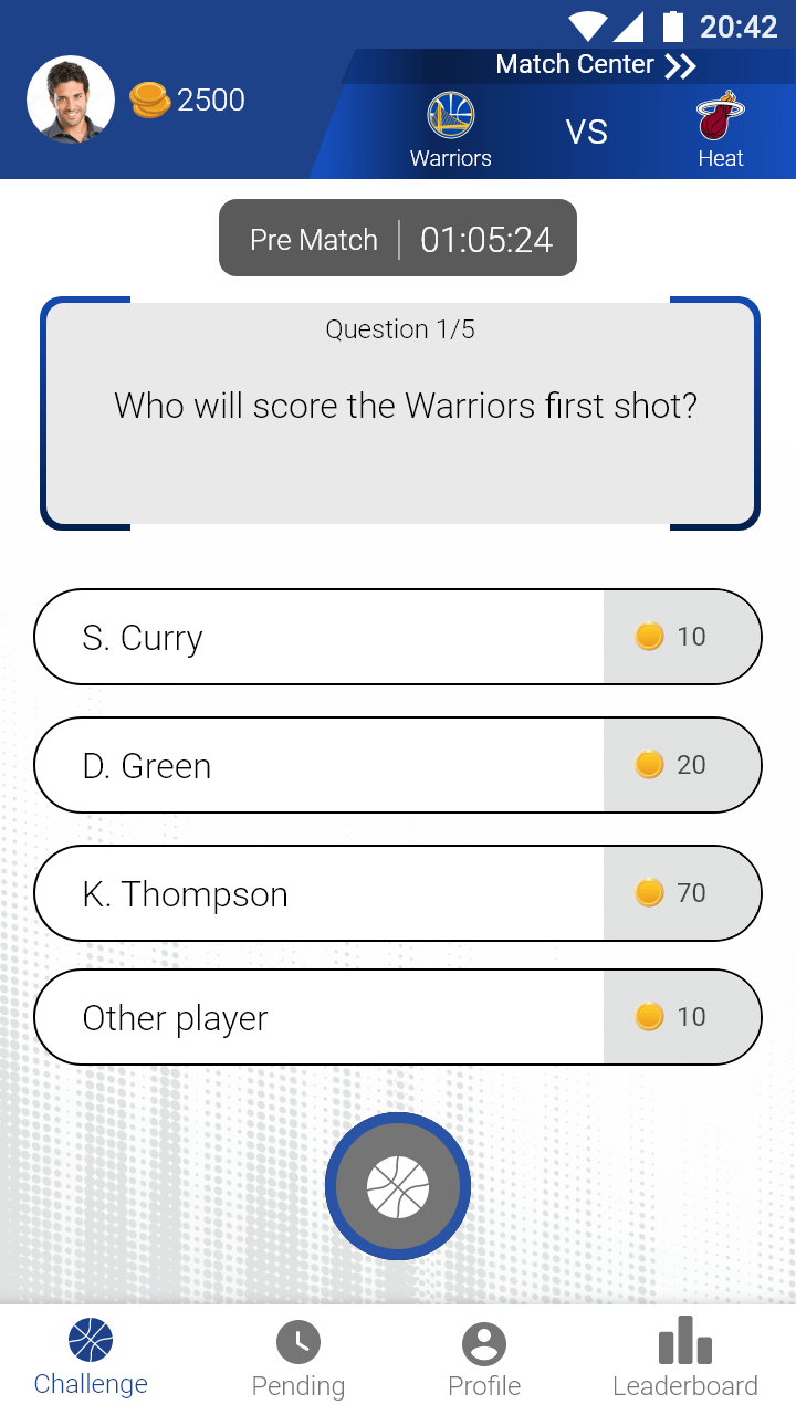
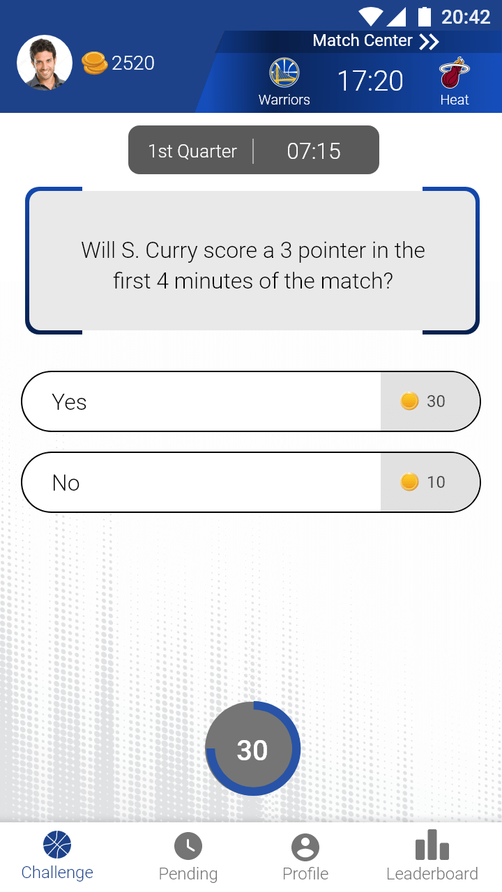
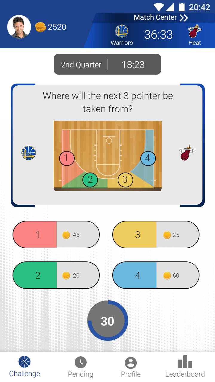
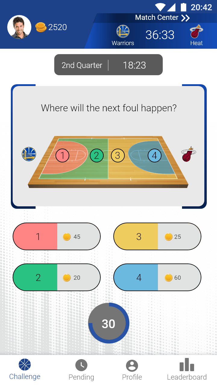
The Sport-Quest UI includes design of various usability processes:









You're welcome to view more UX projects on UX/UI - ClassMe or on Product design at Plus50.