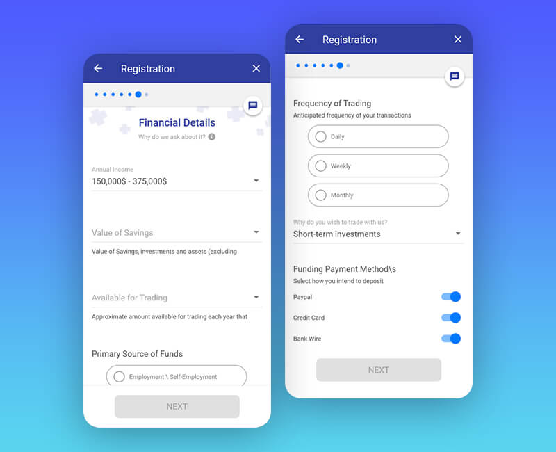
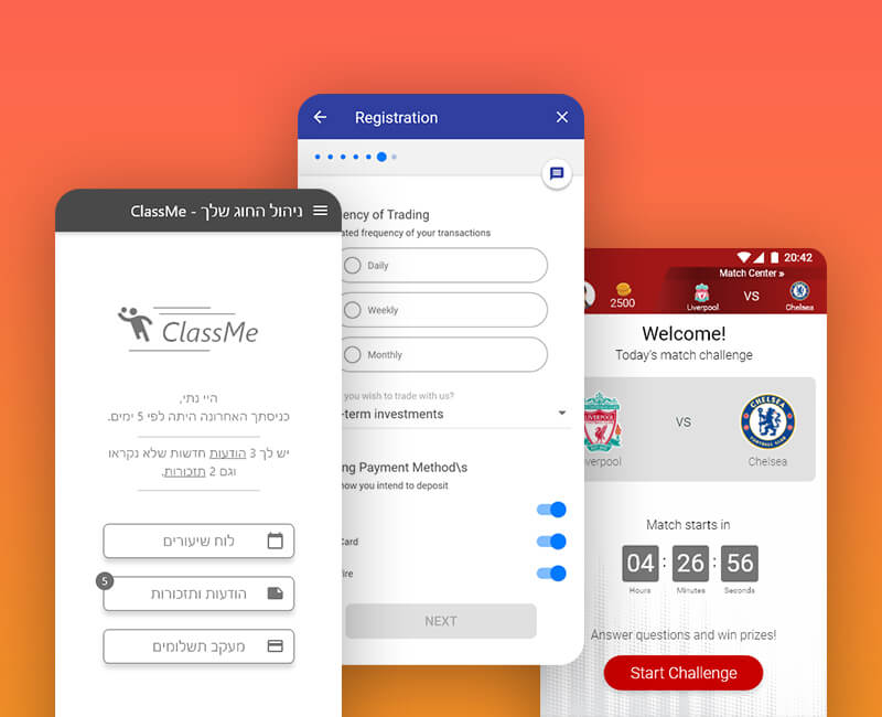
UX/UI at Plus50 -
Homepage UX

Entering a company's new home page design is a challenging, complex and unique task.
The work on the Plus500 home page required a creation of guideline, style and user experience with user interface languages, which would accompany the rest of the website and would be a milestone as part of the company's branding, while constantly striving to meet the user's needs and strengthen the call for action.

Client Plus500
Industry Finance
Year 2016

UX - the Homepage

Lots of technical considerations have to be taken into account alongside creating better UX and desirable innovative and appealing UI, suitable for the finance industry, the company brand and the purpose of refreshing and up to date usability.
Screen resolutions statistics, Mobile first, Retina, Microcopy, CTA position, User flow, Regulations guidelines are just some of the things to consider.

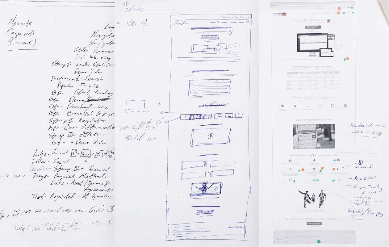
Version Sample A

Homepage UX sketch version A

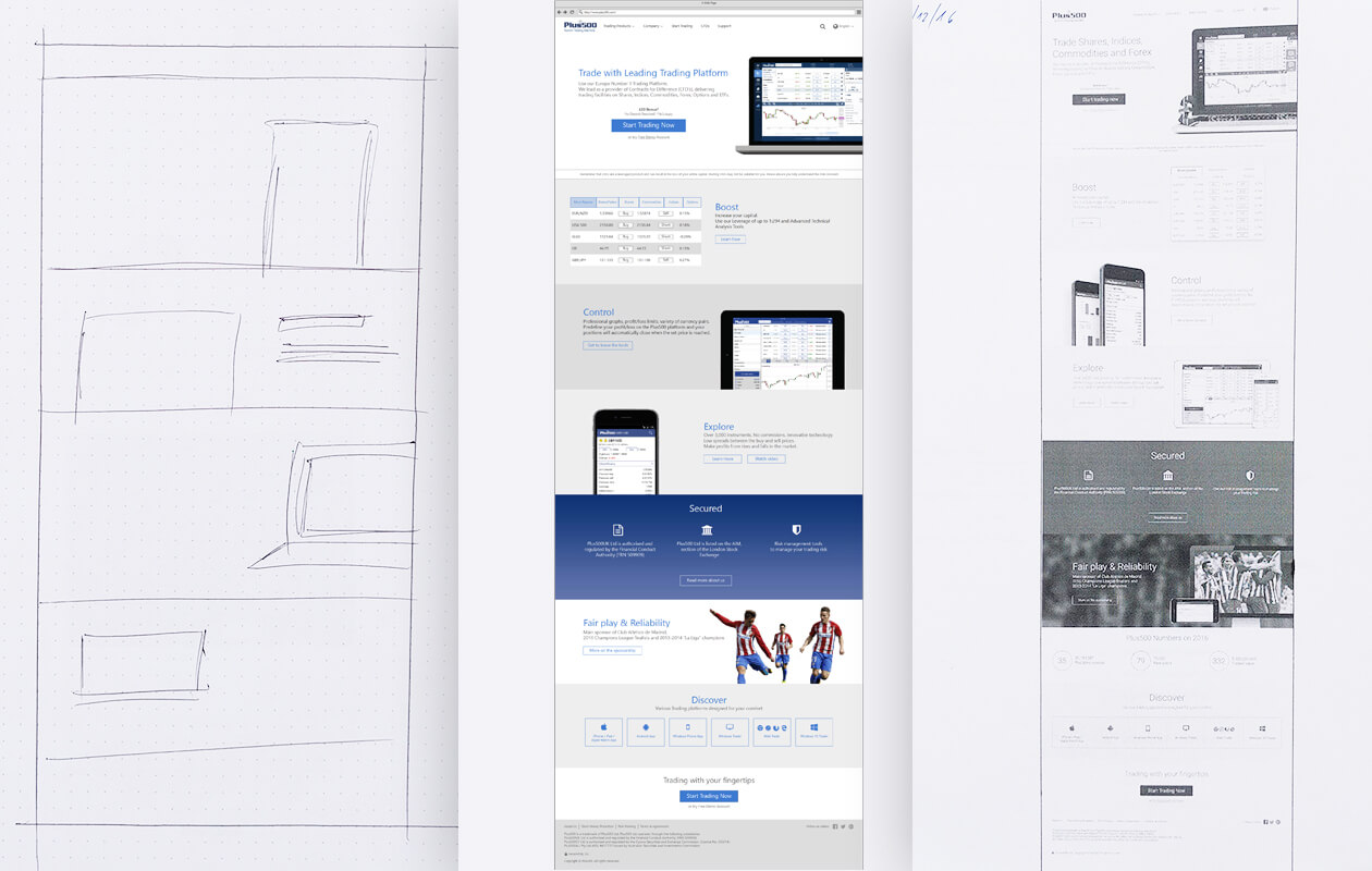
Version Sample B

Homepage UX sketch version B

UI - the Homepage

Each section, with its unique content, earned specific focus and attention, using holistic view for creating a complete product.
E.G: The homepage design is formed with the sections below.

Homepage main section - Navigation, CTA and tablet with trading platform
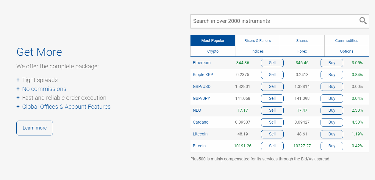
Homepage section - Instruments table and search field
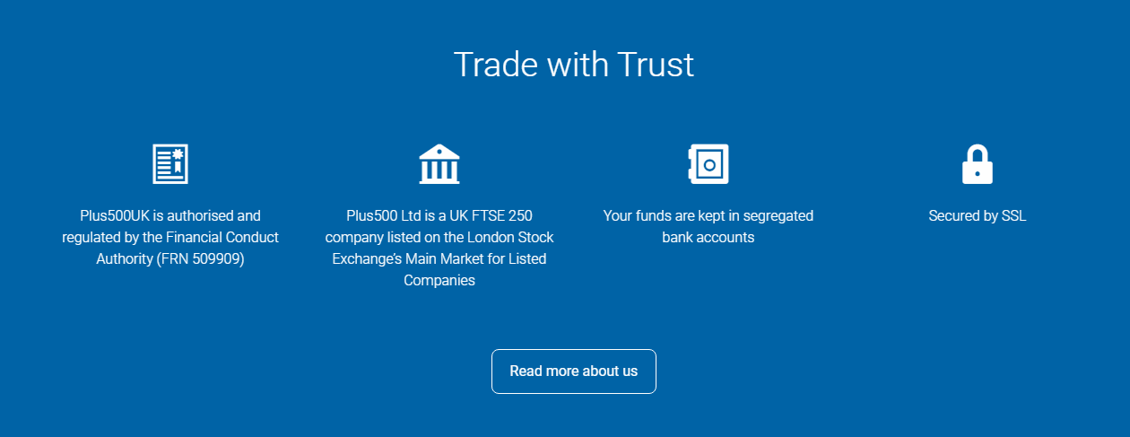
Homepage section - Trust icons and text
Homepage section - List of payment Methods
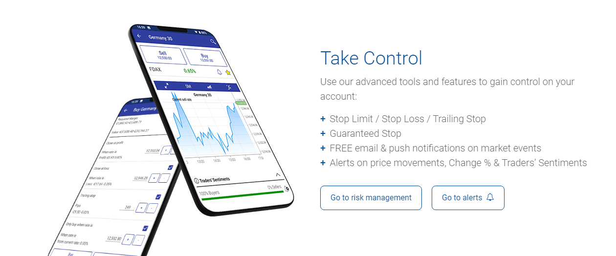
Homepage section - Text near Mobile Phones with trading platform
Homepage section - Text near Tablet with trading platform
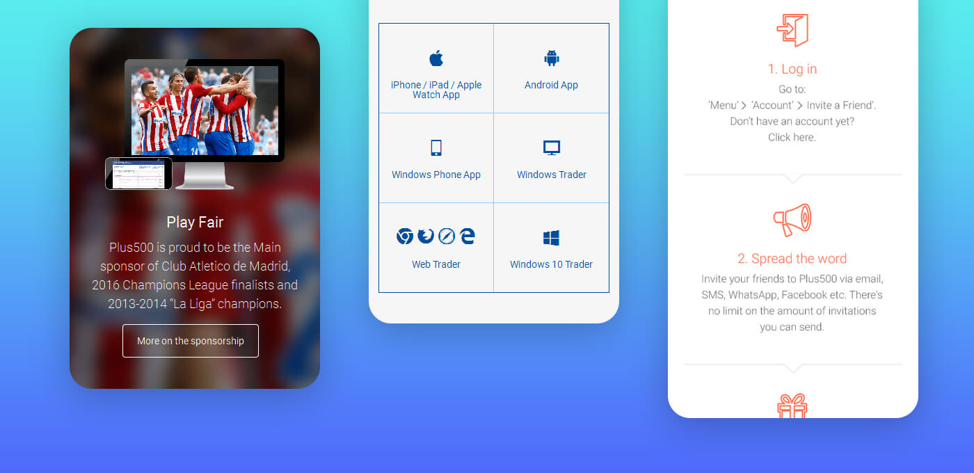
Homepage section - Atletico de Madrid Sponsorship details
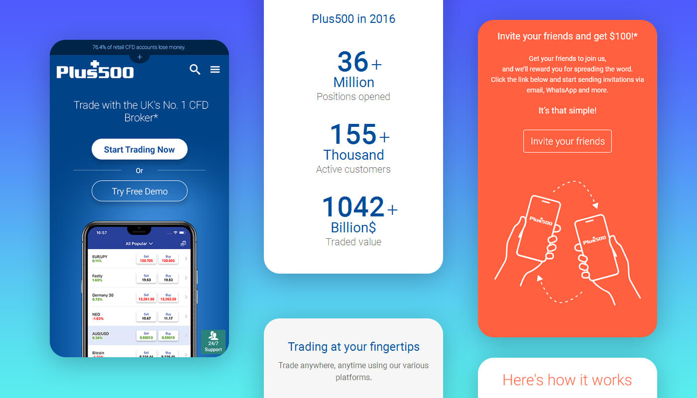
Homepage section - Numbers of value and customers
Homepage section - Trading platforms options with icons
Homepage section - Call to action button
Homepage section - Support button
Homepage section - Footer links and

Mobile View

Website sections on mobile view - hero and numbers
Website sections on mobile view - sponsorship and platforms
Explore some
More of Morieldez Portfolio
E-mail Morieldez

morieldez.design@gmail.com