Led the UX design for a suite of novelty features that transformed the BreezoMeter web application from a data-visualization tool into a high-engagement, interactive platform. This work spanned end-to-end product design - from complex user flows and wireframes to high-fidelity UI - while establishing the UX foundations for the subsequent mobile app implementation.
BreezoMeter pioneered unique air quality and pollen heat map models alongside a wildfire polygon feature. A transformative milestone occurred in 2020 through a partnership with Apple, which integrated attribution links within the Apple Weather app. This collaboration resulted in tens of millions of visitors entering the BreezoMeter web app from all over the world.
The platform serves a diverse global audience, primarily within the 18-34 age group, with significant reach in the US, Germany, Japan, and Canada. The web app maintains 1.5 million Monthly Active Users (MAU) who rely on the platform for air quality insights, news, and scientific data regarding wildfires and environmental hazards.
By designing features like Map Layers Navigation, Air Quality Historical View, Wildfire Burnt Area Representation, and Hazard Reporting, I aimed to optimize the B2C experience. These innovative features were designed to increase user engagement and drive subscription conversions by providing premium value, such as expanded forecasts and enhanced historical data for registered users
 Breezometer Desktop Animated Timeline
") Mockup: Wildfire Burnt Area (zoomed out)
Mockup: Wildfire Burnt Area (zoomed out)
") Mockup: Wildfire Burnt Area (zoomed in)
Mockup: Wildfire Burnt Area (zoomed in)
 Mockup: Wildfire Burnt Area - fire info dialog
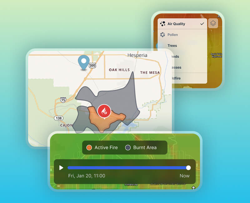
 Wildfire Burnt Area representation - post launch
 Add Hazard Report - design sprint draft
 Add Hazard Report Flow - CTA button to Bottom SHeet to Map icon
Discover additional case studies