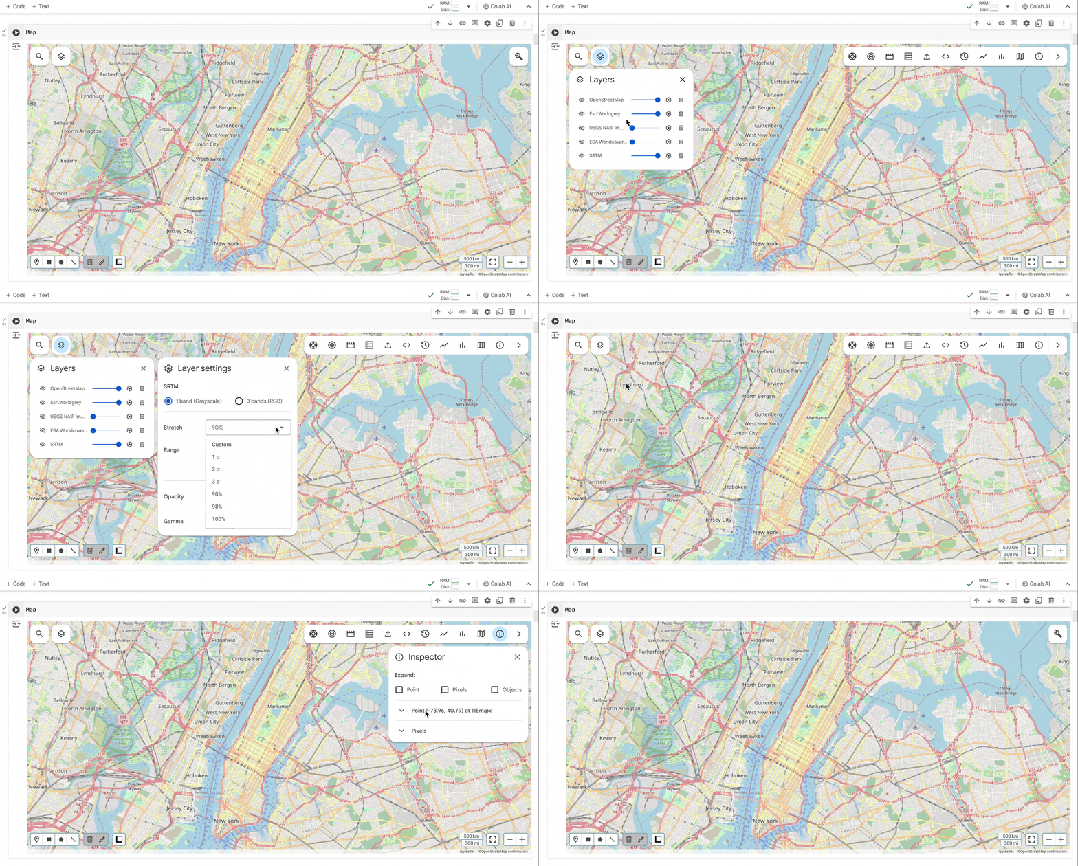
Enhanced the design for a Google Earth Engine Python geospatial Mapping tool,
leveraging UX insights from research to identify pain points and leading the UX/UI
process across wireframes, mockups, and prototypes. This project aimed to improve tool
usability and adoption
(with some enhancements partially published).
Geemap is a Python package for interactive geospatial analysis and visualization using Google Earth Engine (a cloud computing platform).
Geemap makes it accessible to manage and explore Earth Engine data.
Increase the adoption of geemap by leveraging existing functionality and making it a more user-friendly, intuitive, and up-to-date tool.
Make the geemap a credible alternative to the Code Editor (a legacy Google geospatial tool).
Existing and new geemap users, researchers, developers, and academics in the geospatial field.
Design and implement UX/UI enhancements to improve the overall user experience while addressing known pain points.
A systematic competitive analysis of geospatial interfaces was conducted - including ArcGIS (Esri), Amazon Web Services, and Microsoft Azure Maps and more - evaluating UI design, information density, and feature organization to establish industry benchmarks for intuitive navigation and clear user control over various features.
Analysis showed consistent industry behaviors, including default full-screen map views, map controls, and panel usage, alongside different platform variations in the header visibility, navigation functionality, and search discoverability.
An internal audit of Geemap revealed critical UX friction points, such as unclear iconography, complex panel interactions, and inconsistent search behavior, alongside technical limitations in layer management and map resizing.
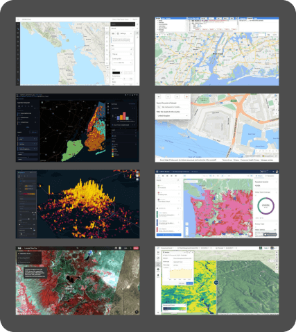 Competitve analysis benchmark
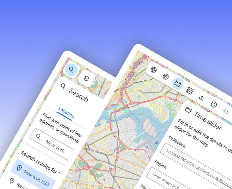
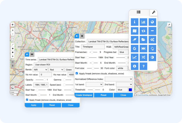 Geemap outdated panels
Task-based interviews were conducted with Earth Engine users to observe interaction patterns and learning curves, with UX design consultancy provided to guide the final insights.
The study was designed to identify user pain points and confusion arising from UI inconsistencies, while evaluating the impact of prior platform habits on tool adoption.
Initial hypotheses regarding usability friction in navigation, layer management, and search were confirmed through direct observation.
Successful user navigation across several complex interactions was observed, leading to a refinement of earlier design hypotheses.
The analysis of the interviews and users’ behavior revealed interaction patterns within several components that are recommended for enhancement, such as the menu, the search bar, and panels in general.
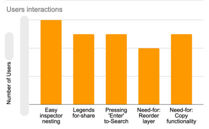 Users interactions on Geemap
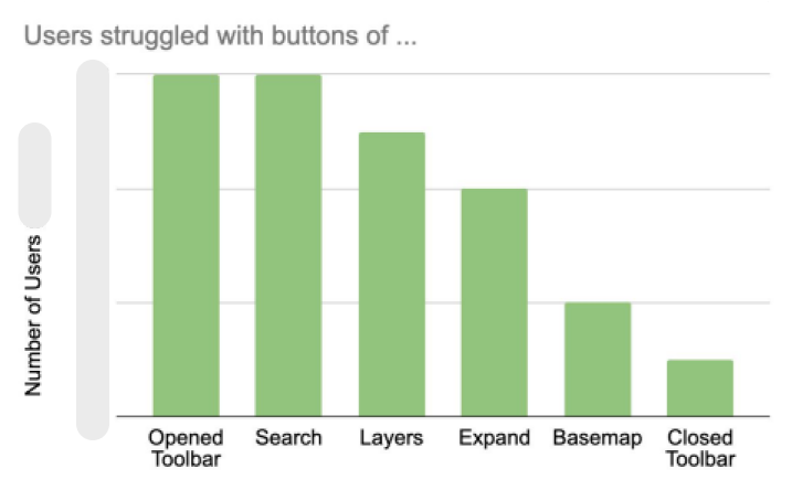 Users struggle with buttons on Geemap
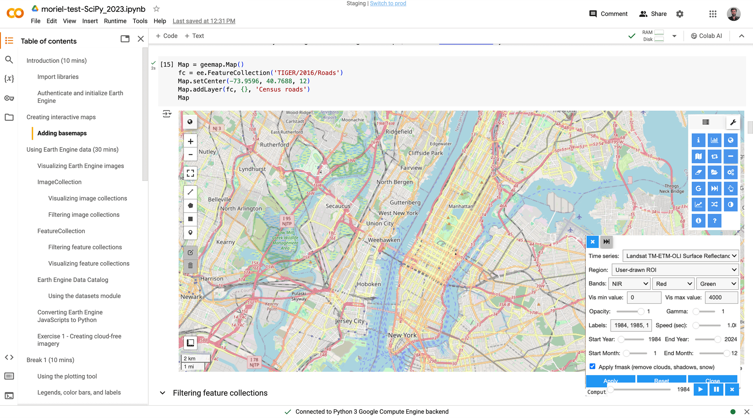 Geemap UX/UI before change
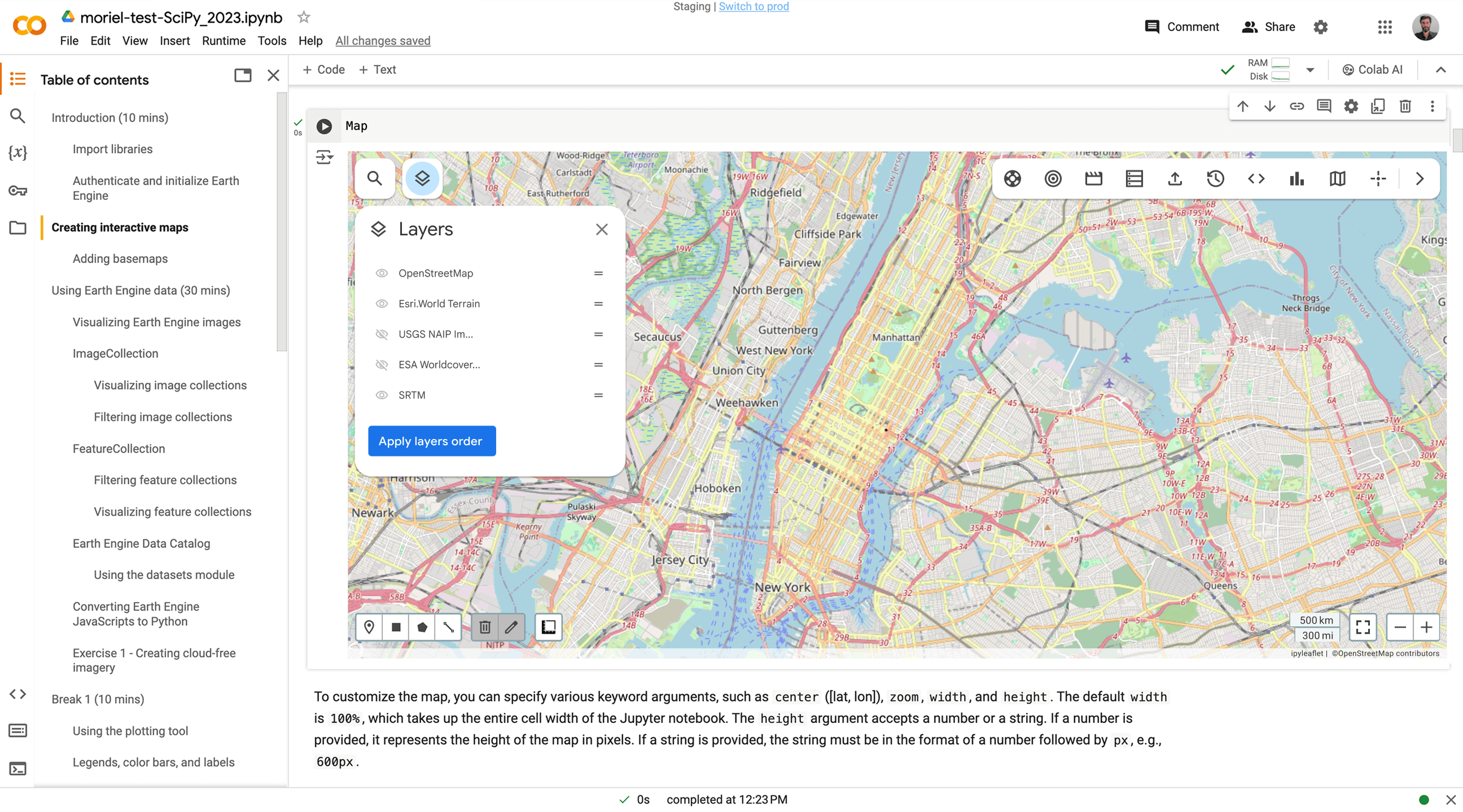
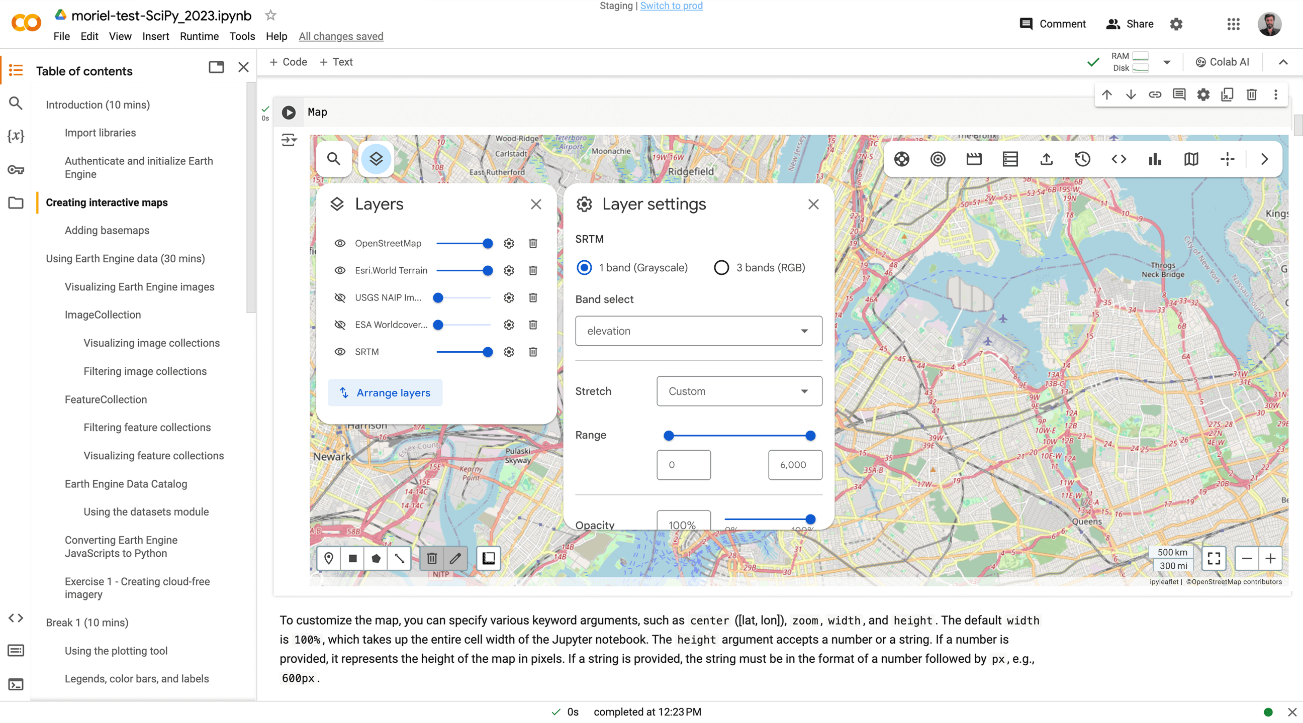
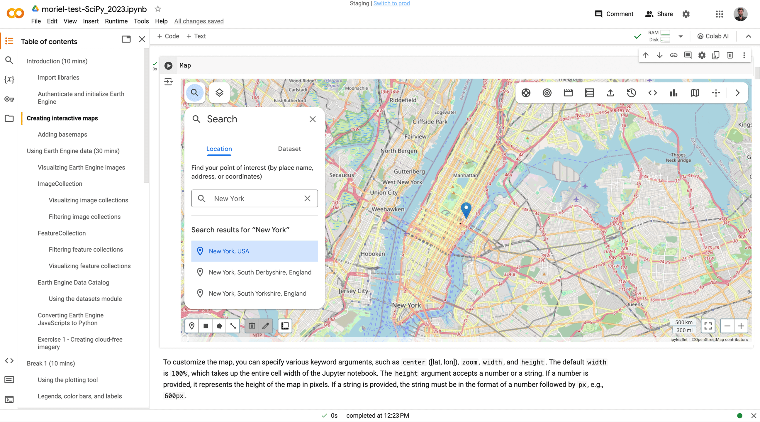
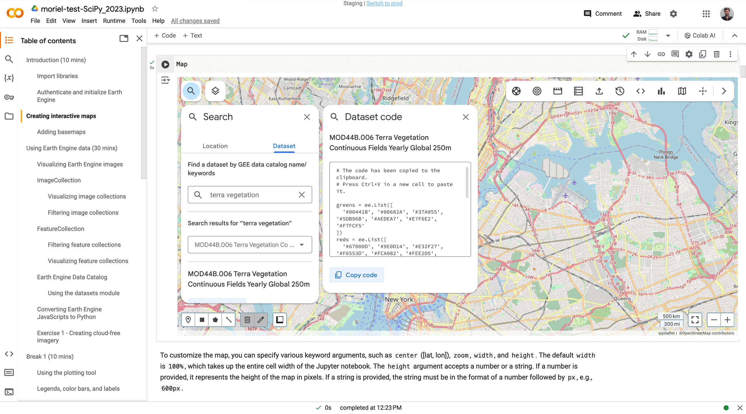
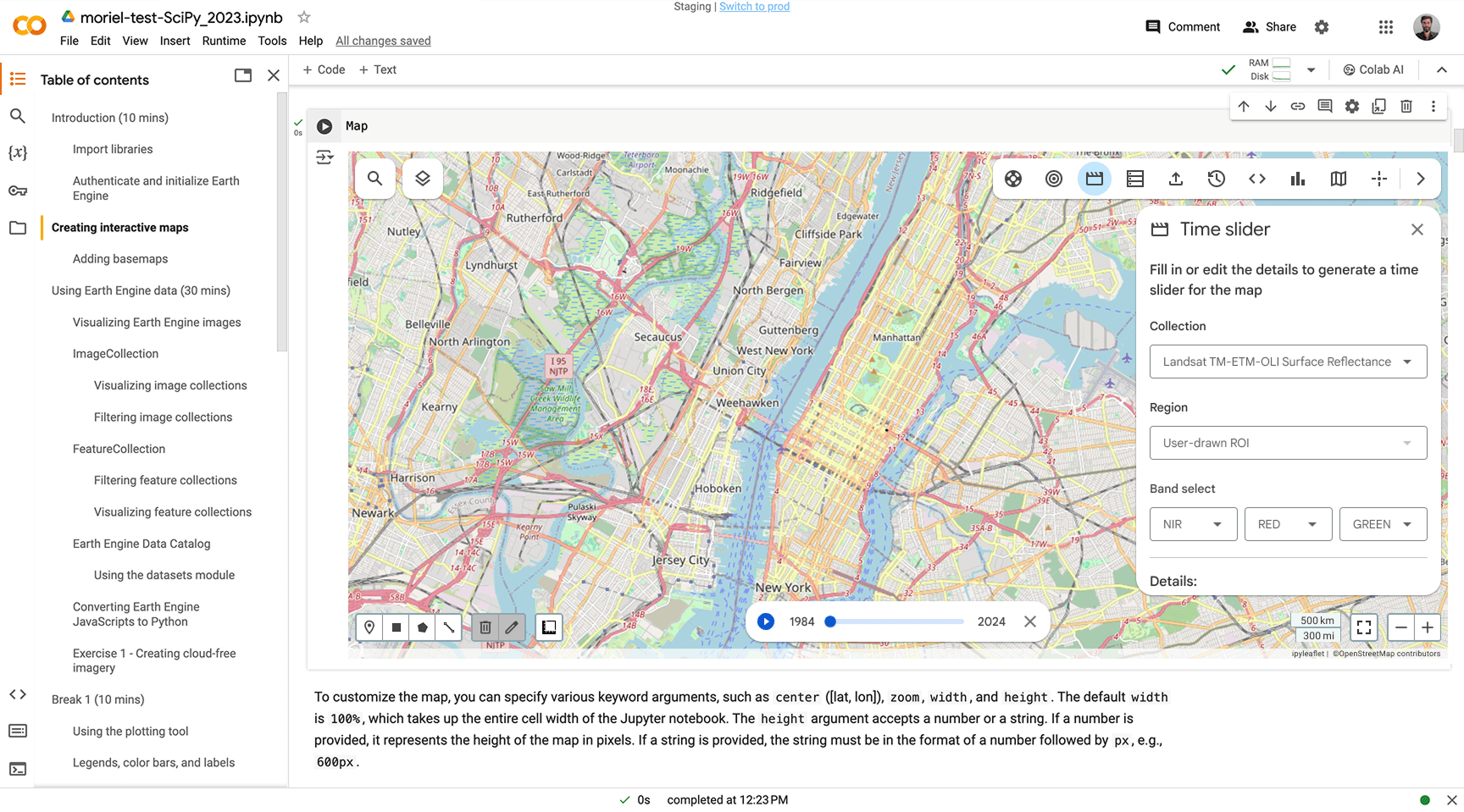
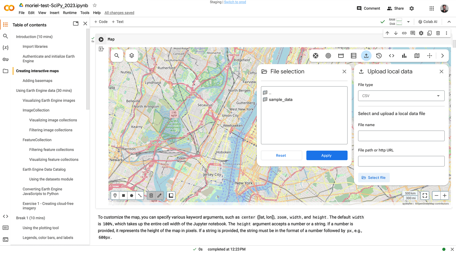
Following the defined project goals, competitive analysis, user testing and research insights, UX design enhancements were implemented to make Geemap more accessible and intuitive. The redesign process included re-evaluating button necessity, optimizing navigation position, reordering menu icons for better hierarchy and making panels consistent.
Discover additional case studies