BreezoMeter
End-to-End Web App UX/UI Redesign

Led the end-to-end UX/UI redesign for the B2C Mobile and Desktop web app platforms. This involved driving a design lifecycle - from discovery and wireframing to high-fidelity mockups and prototypes - to improve website engagement, stickiness, and industry design standards. By collaborating closely with Product Management, Research, and R&D, the feature roadmap was upgraded to reduce cognitive load while HTML/CSS experience was planned to ensure seamless developer handoff and QA.

Breezometer web app redesign concept prototype animation
Breezometer Mobile Web-App Redesign Concept
Stage 1
Initial Discovery
What is the BreezoMeter Web App?

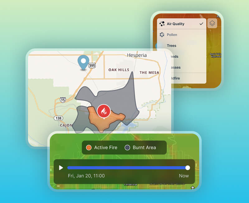
BreezoMeter pioneered unique air quality and pollen heat map models alongside a wildfire polygon feature. A transformative milestone occurred in 2020 through a partnership with Apple, which integrated attribution links within the Apple Weather app. This collaboration resulted in tens of millions of visitors entering the BreezoMeter web app from all over the world.

The platform serves a diverse global audience, primarily within the 18-34 age group, with significant reach in the US, Germany, Japan, and Canada. The web app maintains 1.5 million Monthly Active Users (MAU) who rely on the platform for air quality insights, news, and scientific data regarding wildfires and environmental hazards.

Breezometer deprecated design

Breezometer deprecated desktop web app prototype animation Breezometer deprecated Desktop  Web-App
Breezometer deprecated mobile web app prototype animation 
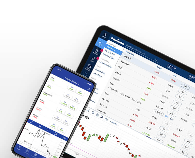
Breezometer deprecated Mobile Web-App
Stage 2
Define the Need
Research Diagnosis

The product team decided to initiate a comprehensive redesign with the primary objective of evolving the B2C website into a more engaging and "sticky" experience.

Following a qualitative UX research phase and a professional UX diagnosis, it was concluded that the interface presented a problem of information density. While the data provided was world-class, the existing interface overwhelmed users at first glance with multiple CTA buttons, tabs, map controls, and information that created significant cognitive load.

It was determined that a more seamless user journey was required, particularly for the high volume of visitors arriving via the Apple Weather attribution link, to ensure they could easily navigate, return to the site, and digest complex information without confusion.


5W1H
  • Why:
    To resolve high cognitive load and increase website "stickiness" and user engagement.
  • Who:
    1.5M Monthly Active Users (global, ages 18–34), most arriving from the Apple Weather app partnership.
  • What:
    A comprehensive B2C Web App redesign intended to refine industry design standards.
  • Where:
    Primarily the mobile web platform, with secondary desktop usage, serving a global audience (mainly from US, Western Europe, Japan, and Canada).
  • When:
    With entering the web app, mostly via the Apple Weather app partnership attribution link.
  • How:
    Through a data-driven, mobile-first design strategy and a unified design system, supplemented by the creation of dedicated information dialogs to simplify lengthy explanatory text and complex scientific data.
Stage 3
Web App Redesign - Strategy
UX Challenges - Balancing Data, Accessibility, Usage

The challenge lay in making environmental health data understandable and interactive to protect and help the public. The platform required a user-centered approach to provide data visualization that met the needs of both occasional visitors and daily power users. Key questions addressed during the process included:

HMWs (How might we)
  • HMW - Make the web app more personalized, friendly, and accessible for a global audience?
  • HMW- Reduce the number of components and tap options to streamline the user journey?
  • HMW- Develop reusable components to optimize efficiency for both design and development?
Redesign Concept Focus

The redesign was aimed to evolve the B2C platform into a more engaging and "sticky" experience.
This transformation was anchored in several strategic pillars intended to refine industry standards and elevate the user experience.

  • Better UX:
    Reducing cognitive load and improving the overall flow.
  • Aesthetics:
    Modernizing the look and feel with a clean UI.
  • Design System:
    Standardizing typography, colors, buttons, and cards.
  • User Journey:
    Tailoring the experience specifically for air-quality-conscious users.
  • Mobile-First Approach:
    Prioritizing the mobile web experience to ensure high performance and accessibility for the majority of the global user base, as desktop usage accounted for only approximately 5% of total traffic.
  • Business Goal:
    Directly improving engagement and website stickiness.
Friction Mapping & Prioritization

Breezometer - Solution Space Solution Space
Breezometer - Impact-Effort Prioritization Matrix Impact-Effort Prioritization Matrix
Stage 4
Web App Redesign - Practical Execution
UX Solution - Simplification and Hierarchy

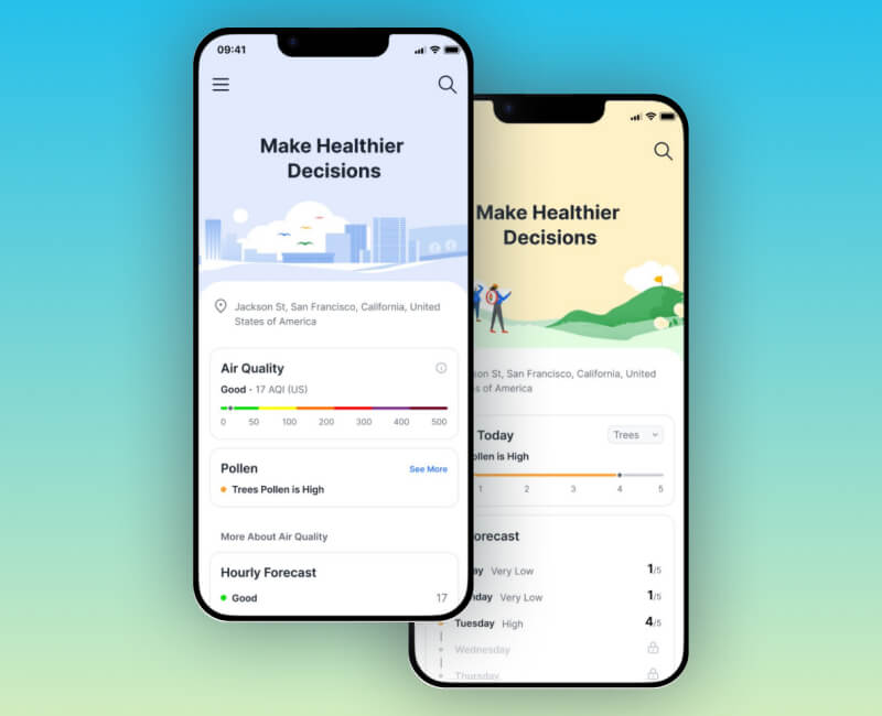
The problem of "information overload" was addressed by prioritizing the most valuable features: the Location, the Air Quality Gauge, and the Map. By reducing the volume of text and competing calls-to-action, an intuitive navigation experience was created.

Here are some of the Key UX Updates:

  1. Horizontal Scale Gauge:
    Transitioned the air quality gauge to a horizontal scale to better fit the web app's vertical flow and provide a simpler, up-to-date look.
  2. Card Optimization:
    Modified content cards to create a cleaner, "less loaded" look with a more defined hierarchy to highlight actionable data.
  3. Streamlined Controls:
    Minimized UI clutter by reducing the number of buttons and tabs, focusing the user's attention on primary tasks.
  4. Progressive Disclosure:
    Moved deep-dive scientific explanations to separate pages or dialogs to maintain a clean interface, appearing only when requested.
  5. Spacious Hero Section:
    Implemented an appealing and more spacious intro image paired with short, high-impact text to improve the initial "first-glance" experience.
  6. Mobile Application Alignment:
    The redesign focus and refinements received a dedicated interpretation for a new mobile application design, ensuring the user experience remained aligned across all platforms.
Web App Redesign Concept

Breezometer Mobile Web App - Air Quality mockup Air Quality mockup redesign
Breezometer Mobile Web App - Pollen mockup Pollen mockup redesign
Breezometer web app redesign concept prototype animation Breezometer Mobile Web-App Redesign Prototype
Explore some
More of Morieldez Portfolio
E-mail Morieldez

morieldez.design@gmail.com