Led the end-to-end UX design for multiple Google Earth features, driving the full design lifecycle from discovery and user journey analysis to the design of initial-concepts, wireframes, high-fidelity mockups and microcopy.
For the "Historical Street View feature" (detailed below), the launch resulted in significant engagement growth and feature adoption, and it is currently serving millions of users worldwide.
This project was officially featured in a Google Earth announcement on Medium..
(* A second high-impact feature is currently in final development stages and scheduled for launch.)
A user journey is the end-to-end sequence of tasks and interactions a user performs to successfully achieve a specific goal.
User Journey Example
As a Google Earth user who is an Urban & Environmental Researcher →
I want to view historical Street View images of various locations →
So I can explore, track & analyze Street View level changes while maintaining viewing angle & position →
To achieve this, I need to activate a timeline to navigate between past Street View images.
Implement a "Historical Street View" feature to provide a dynamic "time travel" experience, enabling users to explore past Street View imagery and observe urban and geographic changes over time.
To establish a foundation for the new feature leveraging Google's archived imagery data an exploration of the current Street View experience was conducted across Google Earth and Google Maps, alongside an audit of Google Earth’s existing satellite-level historical imagery and timelapse functionality.
Exploring the Google Earth Desktop (Web App) interface revealed, over the main interactive imagery, a semi-transparent top bar with address data and utility icons (Share, More, Back), while the bottom area contained attribution data, image capture button, and orientation controls (North arrow, Zoom).
The mobile experience showed a high similarity to the desktop UI, maintaining the semi-transparent top bar with address, while interaction buttons (e.g., North arrow and image capture) were updated for smaller touch-screen layouts.
An audit of the historical imagery implementation in Google Maps revealed a "floating card" for date metadata and a bottom panel using image thumbnails and a mini-map to facilitate historical navigation between historical dates.
Analysis of the existing satellite-level historical tool showed a specific interaction pattern where a toolbar icon triggers a sticky timeline panel, allowing users to toggle between past aerial photographs or transition into a "Timelapse" video mode.
 Google Earth Street View (Desktop / Web App)
 Google Earth Street View (Mobile App)
 Google Maps Street View
 Google Earth Historical Imagery
 Google Earth Street View Updated Flow
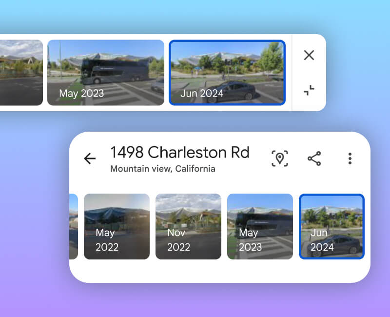
Integrating Historical Street View into the Google Earth Desktop mode is designed to encourage the exploration of past imagery and increase overall user engagement. To achieve this, the following UX solutions were integrated into the flow to seamlessly incorporate the new functionality:
The app bar was refined to improve accessibility and de-clutter the main imagery. By using a solid background and clustering interactions - including a relocated "Capture Image" action - the design ensures consistency with the Google Earth ecosystem while enhancing the readability of the header.
A prominent "See more dates" button serves as a familiar entry point, while a "Back to latest" button allows users to reset the view. These buttons utilize specific phrasing, action-oriented iconography, and coloring to clearly distinguish between actions and between active and inactive button states.

A wide floating panel houses 16:9 thumbnails, providing an intuitive way to spot environmental changes. The panel is fully responsive to different screen sizes and various amounts of images, and includes "X" and "Collapse" buttons that align with existing Google Earth floating panel patterns.
Navigation is simplified through a "scroll and tap" gesture, with the latest imagery anchored to the right to match the standard of another Google Earth historical timeline. This allows users to jump easily between non-sequential dates, leveraging existing mental models from Google Maps.
Users are provided with two clear methods to exit the historical mode: the "Back to latest" CTA in the app bar or the "X" on the panel. Both options reset the imagery to the current date while keeping the Street View session active.

When space is a priority, the panel shrinks into a compact date chip. This state maintains the collapse functionality found in other Google Earth features, allowing users to toggle through imagery via "next/prev" controls or tap the chip to expand the full list.

Implementing Historical Street View into the Google Earth Mobile mode is designed to ease the discoverability of past imagery and enhance overall user engagement, while leveraging Mobile functionalities and patterns. To achieve this, the following UX enhancements were integrated into the flow to seamlessly incorporate the new functionality:
The app bar was removed to de-clutter the main imagery and improve the readability and accessibility of the address and icon-buttons. This change ensures the user’s focus remains entirely on the immersive Street View experience while maintaining essential controls.
Functionality and information were clustered into a responsive bottom sheet to ensure consistency with Google Earth mobile patterns. This layout organizes action buttons - including a relocated "Capture Image" action - and ensures responsiveness on narrow screens by moving secondary actions into an overflow menu.
A prominent "See more dates" button serves as the primary entry point, utilizing the same hierarchy as other Google Earth bottom sheet buttons. To maintain a clean interface, the button does not appear when historical imagery is unavailable. Users can exit historical mode and reset to the latest imagery by simply tapping the "Back" button within the bottom sheet (unlike the desktop mode, which features a specific "Back to latest" CTA).


Navigation is optimized through a "scroll and tap" gesture using 1:1 aspect ratio thumbnails, which provide visual harmony, easy navigation between non-sequential dates, and UX differentiation from Google Maps. Following the standard of another Google Earth historical timeline, the latest imagery is anchored to the right.
 Web App thumbnails - Long image list
 Web App thumbnails - Short image list
To de-clutter the view, the bottom sheet can be dragged down so a compact date navigation chip becomes visible. To expand back to the full thumbnail list, the user can tap the chip or drag the bottom sheet back up.


Discover additional case studies